
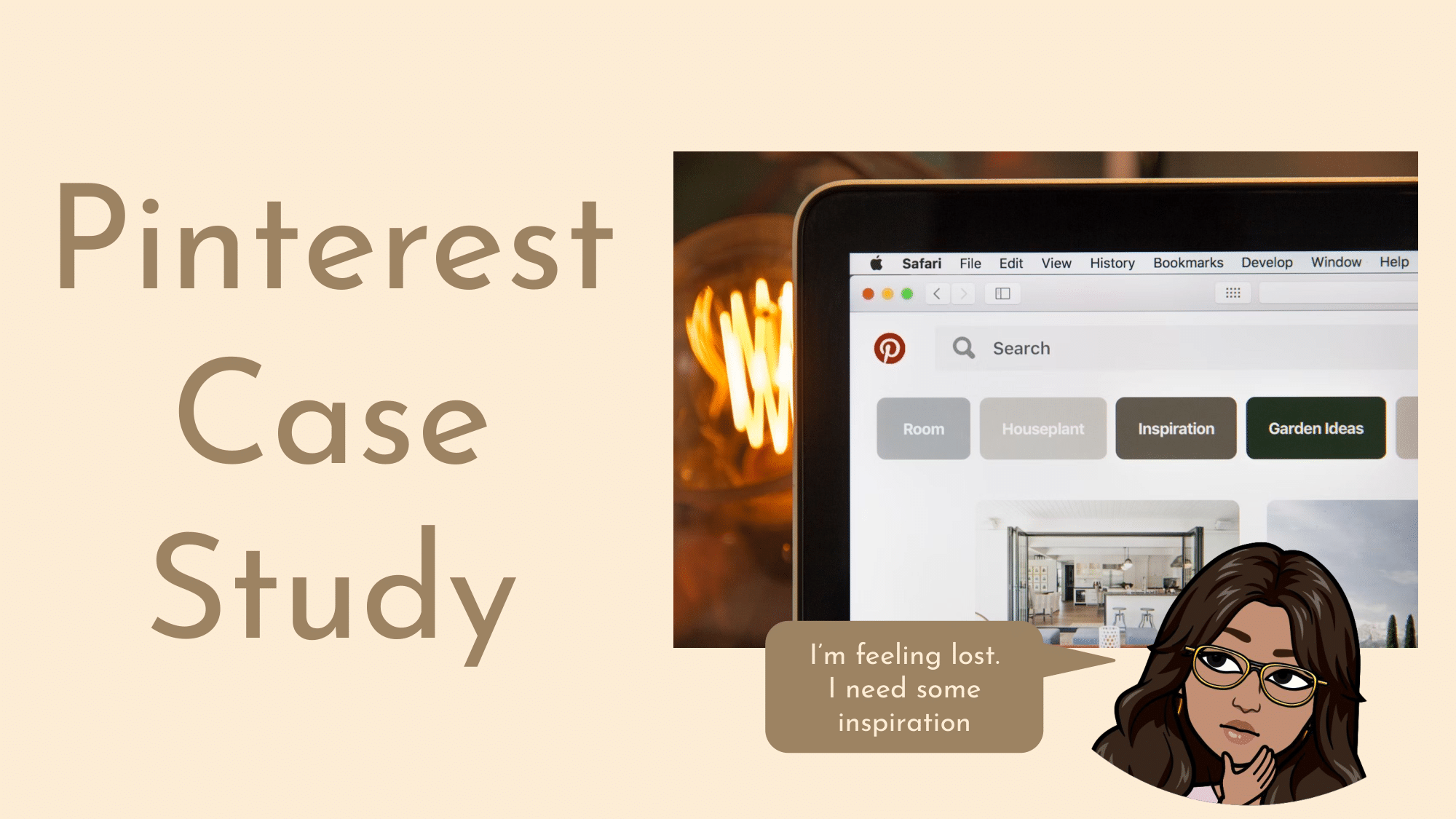
Pinterest is a popular app/site for moodboarding and curating themes and inspiration. I personally love to garner inspiration from Pinterest for everything from recipes, fashion, interior design and art.
The ability to use the same platform for a variety of interests gives Pinterest a unique value proposition. While Pinterest currently has the market cornered for moodboarding sites, there are always ways to improve and evolve the product.
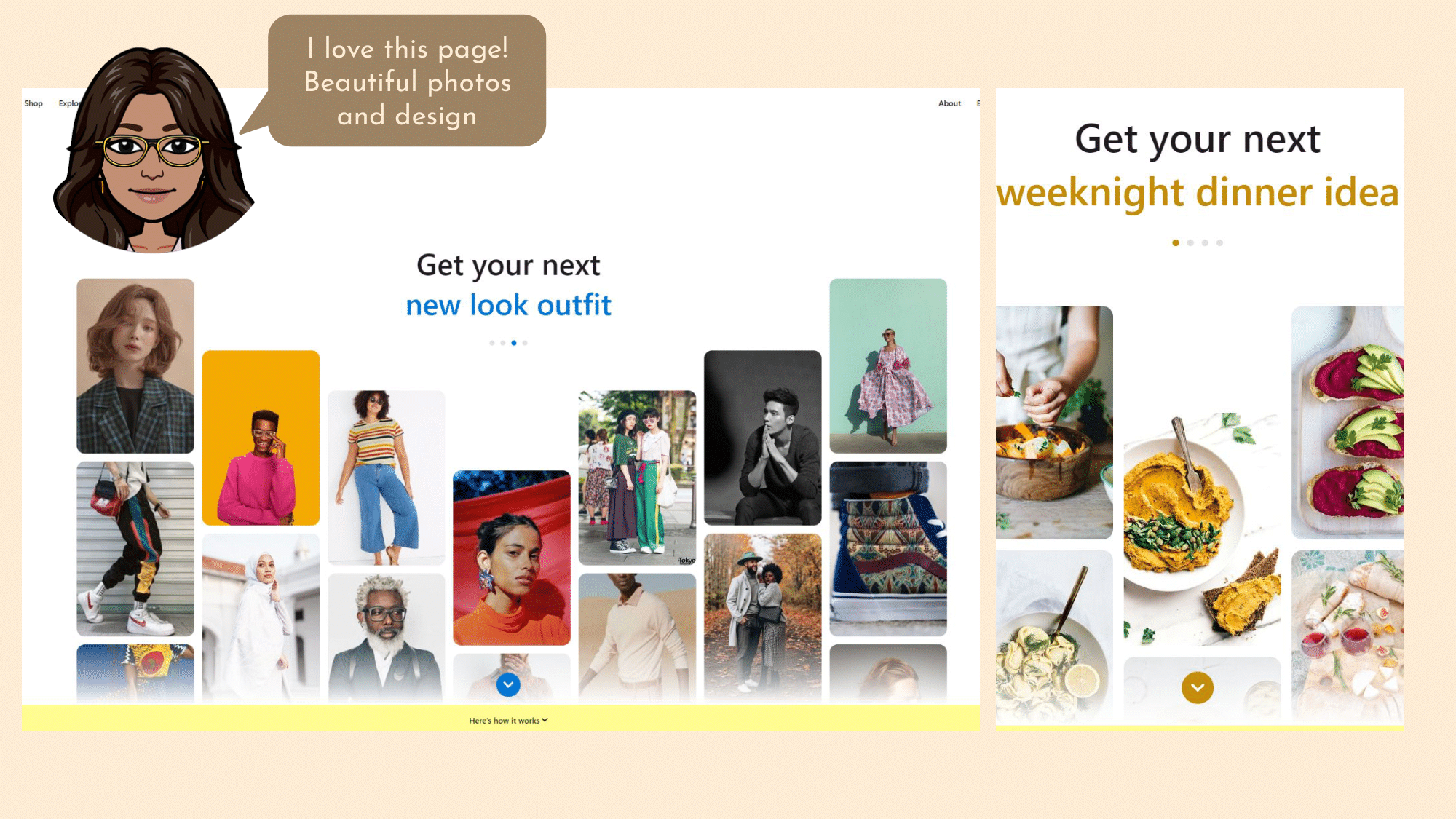
When I enter the Pinterest landing page as a new user, I am immediately both interested and calm due to the relaxing but appealing layout. It cycles through 4 different options here giving examples of inspiration photos for an outfit, gardening, dinners, and home decor. These categories are popular reasons to use Pinterest and are relatable to most users. It cycles through these 4 categories every 5 seconds. While the white space is nice for a minimalistic feel, it does seem a little odd to have so much white space just at the top.
Also I feel as though there should be an option to select an image here that interests you. This will then prompt the user to create an account in order to save that image to their personal board. However, you will lose these images when you click the button to log-in/sign up which may be frustrating for a user that saw something they liked in the introduction screen.
The yellow bar is a good way to indicate that more information lies below. However, this being the landing page, it would have been nicer to use some of the color themes we have already seen. Like for example, the class pinterest red or the blue on the arrow/text. Even the yellow color that is used on the dinner page would be a cohesive choice. The yellow they chose feels out of place here, but it does look beautiful as the background color of the next page.
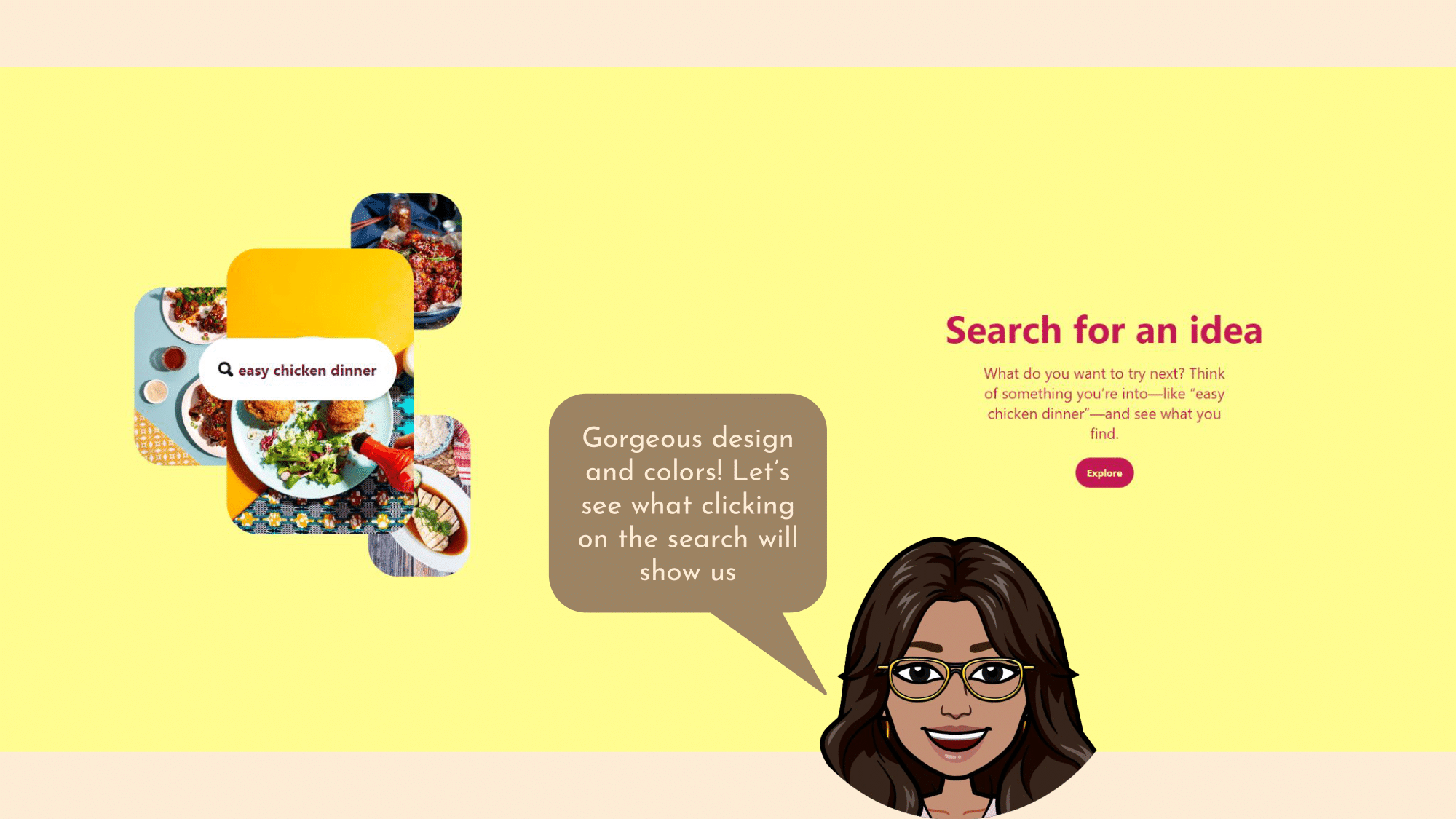
One thing that I do love is that with one scroll downward it takes me directly to the next page. It is frustrating as a user having to rotate the scroll wheel multiple times just to get through the introduction information. The one scroll trick solves this and saves the user time and frustration.
This is a nice minimalistic page following the same theme as the intro page but now bringing in some color. It’s job is to explain how to use Pinterest, but only uses an image to describe it. It would be nice to have a simple animation instead that showed a user searching for “easy chicken dinner”. This way the new user can see how it would actually look when they used this feature. In this image most of the images are covered and it does not look like how it would actually be in the website. They did take my advice though from the previous page by allowing the user to click on that query and see what actually would show up.
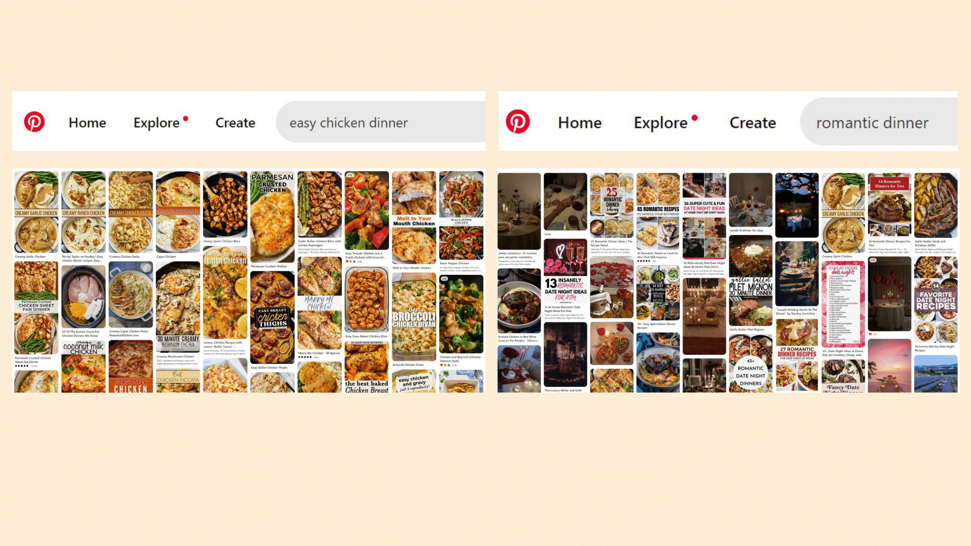
But honestly this page is very overwhelming and full of very similar images that cover the entire page. They forgot about their whitespace design entirely here and decided to fill every nook and cranny with pictures of food. It might have been a better idea to use something a little more aesthetically pleasing as their example query. Maybe something like “romantic dinner” so that they do have recipe ideas but also some photos of decor and couples.
I am still missing the whitespace from the introduction pages in these boards but this is much nicer on the eyes. With images of food and recipes mixed in with some beautiful table set ups and gorgeous scenery photos. As an introduction for a new user you may want to use an example that is going to produce a variety of images.
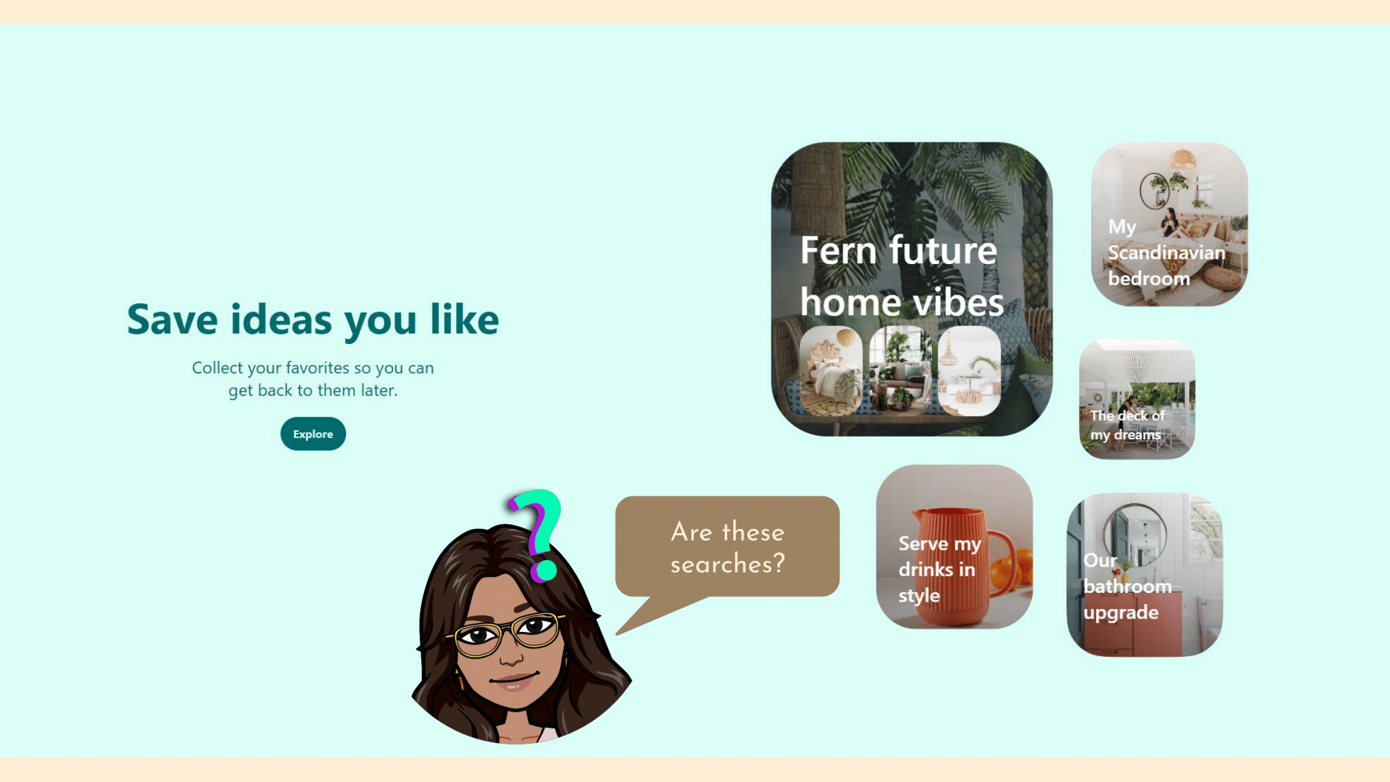
The next page of the introduction looks like this. Again, here we would benefit greatly from an animation that shows what happens when a user saves an idea. As I am familiar with Pinterest I know you can create multiple boards to curate ideas for a variety of ideas. However as a new user I don’t understand what is happening here. My first thought would be that they are searches but the titles make them seem more personal. This would be a perfect opportunity to introduce the concept of boards to the user rather than just “save ideas”.
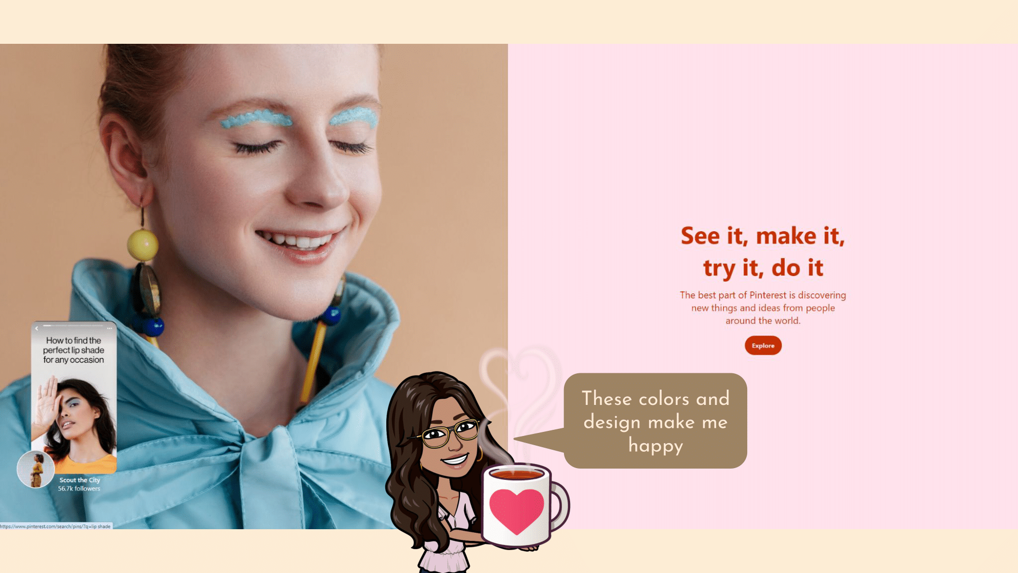
The 4th page of the introduction looks like this. Beautiful consistency and simplicity in the design, while still making use of attractive colors that draw the eye. The title text (“See it, make it, try it, do it) is a little long and too repetitive without any defining characteristics for each of the parts. If there was a small graphic next to each of the parts to separate them it may be more manageable. But without that, I am tempted to skip over the whole phrase. Also try it, make it and do it are pretty much the same so to simplify this I would reduce this to “See it - Save it - Do it”. This brings back the two steps that we have already been through which are See and Save it.
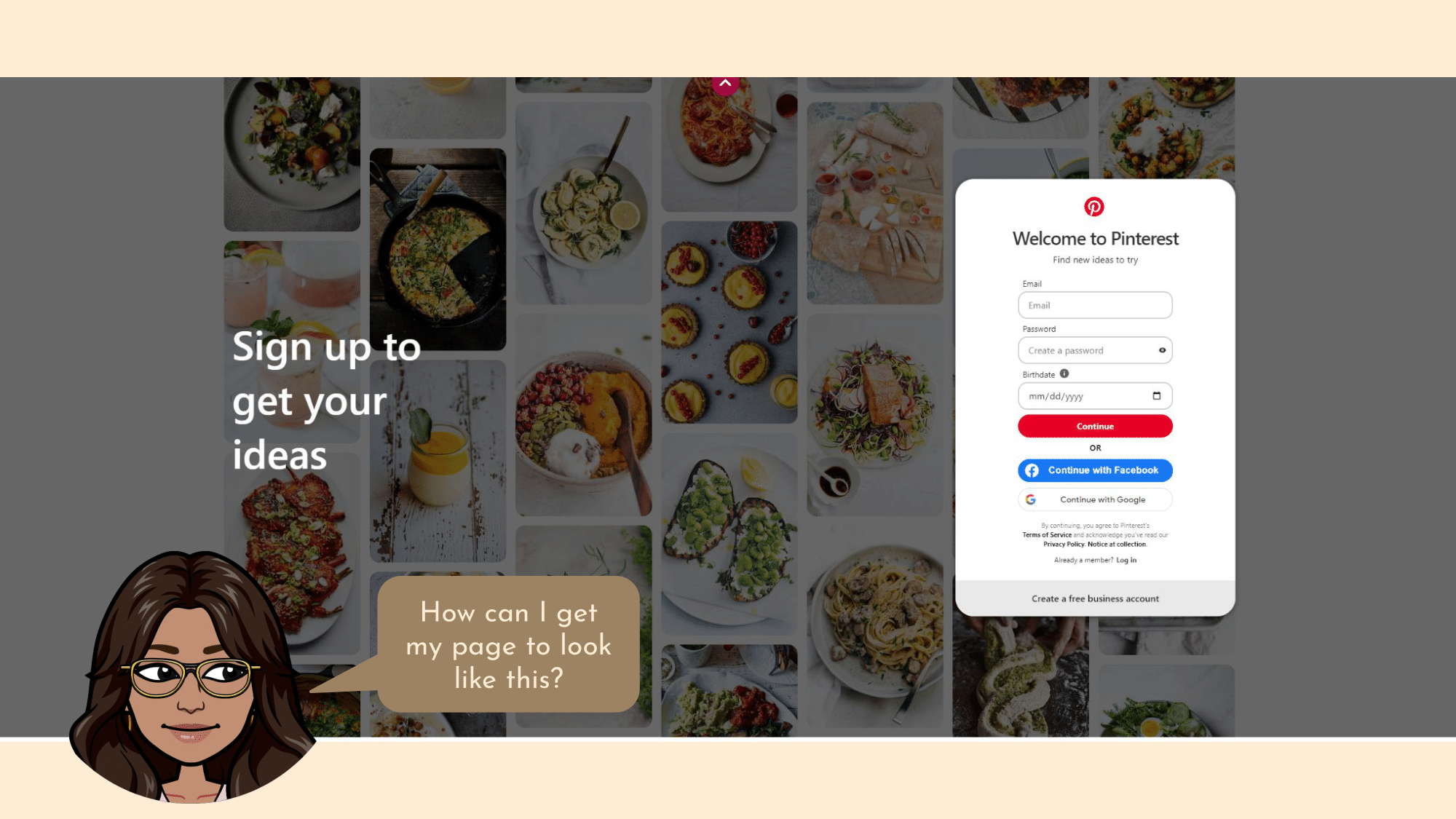
The final page on the landing site looks like this. First of all I immediately notice how much more aesthetically pleasing the board of ideas looks in the background of this page than it did in the examples above. This is the pinterest I want to use but is misleading because that is not how these searches actually look. Next the login window, while simple and not overwhelming, probably does not need to ask for your birthday at this stage. To attract more users to complete the sign on stage you want the minimum number of inputs possible. Instead I would prompt the user (with a skip option) after they have signed in, and ask when their birthday is. When I hover over the information button next to my birthday, Pinterest tells me that it is using this information to personalize my recommendations better. However, forcing users to complete this action is discouraging. Instead if you nudge the user after they have signed up with a tagline letting them know why it benefits them, the user will feel as though they are simply improving their experience at their own discretion.
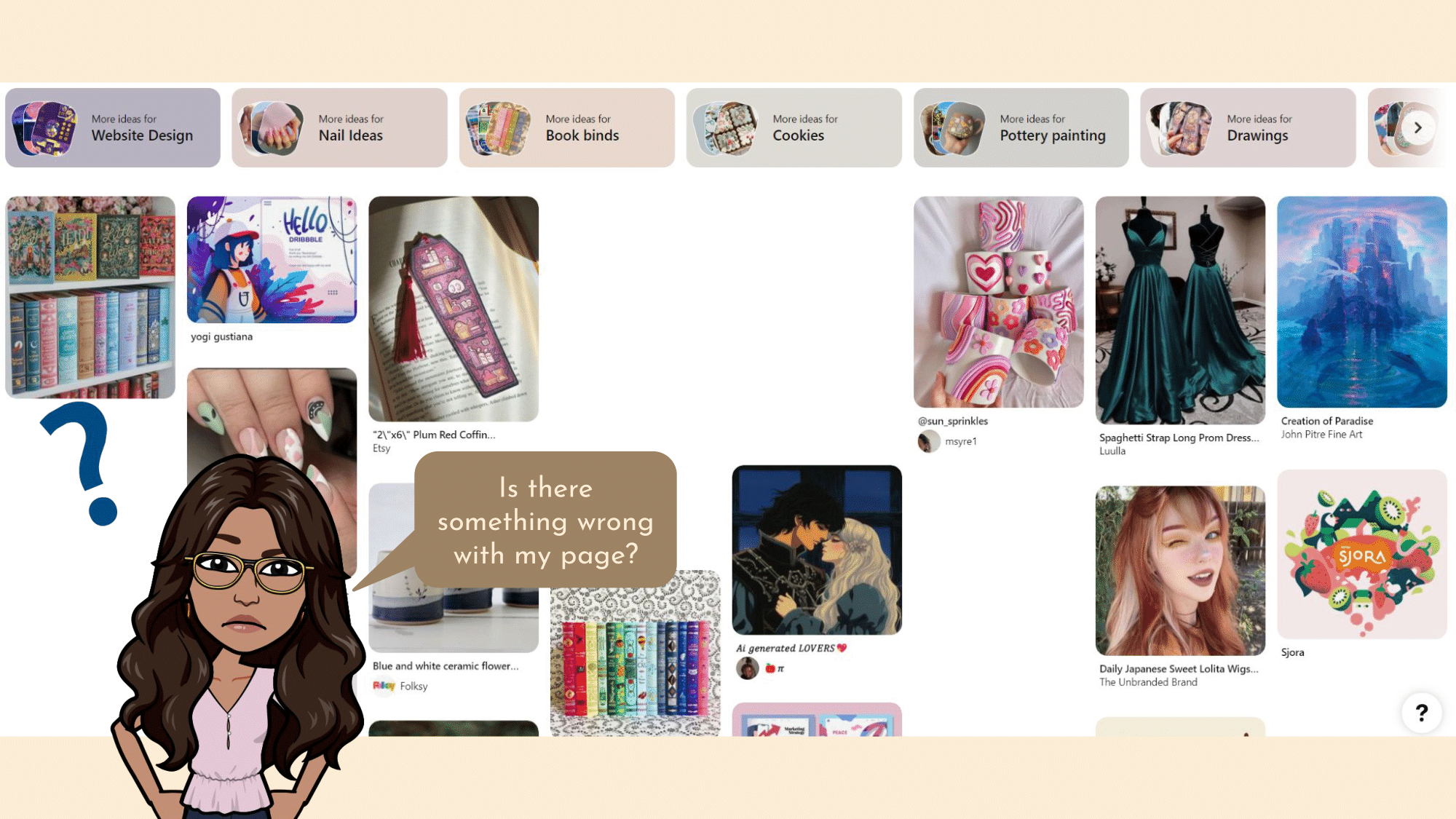
Once I have logged in the Home page gives me a bunch of pins that match the things I have been looking for or that match my overall aesthetic. The first thing that I noticed is the blank spaces in the Home feed. While I believe Pinterest was trying to capture the whitespace design showcased in the introduction pages, this feels random and unintentional. Actually at first I thought that it may just be pins that aren’t loading properly, but I checked multiple pages and they all had this design. The white space should have some juxtaposition and intentionality. This way the user feels the minimalism effect without confusion.
One of the best features of Pinterest is the More Ideas or More like this filter. Once you have saved a few ideas to the board it gives you the option to find others that match the same aesthetics of the saved pins. This feature is amazing because Pinterest, like any other search engine, has a vast amount of information and sometimes it is hard to put into words exactly what you are looking for. With this feature you just need to find a few pins that describe your search and go from there.
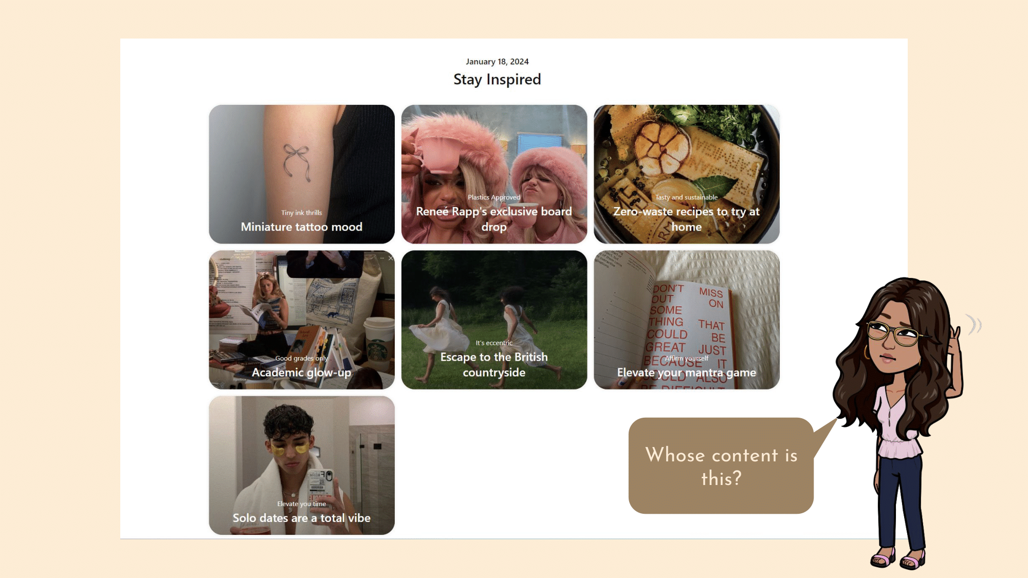
The Explore Page looks like this on the other hand. Explore shows you other people’s boards that you can also view and save pins from. To be honest I wasn’t sure what this page showed at first until my attention was caught by “Renee Rapp’s Exclusive Board Drop”. Renee Rapp being the newest icon and the word exclusive makes me feel as though I am getting access to something special here. Using this information you could deduce that this page is to see other influencer’s boards. However, looking at the other options, these boards are filled with saves from many different users rather than just one. Now I am confused again as to what this page holds. A small description at the top would clear up any confusion. What is also odd is that it is giving me 3 rows but the 3rd row only has 1 board. It feels incomplete. I checked and this is not a feature of window size because the elements don’t move with the change in browser window. They should definitely fill out the page to make it both visually appealing and take advantage of all the available space.
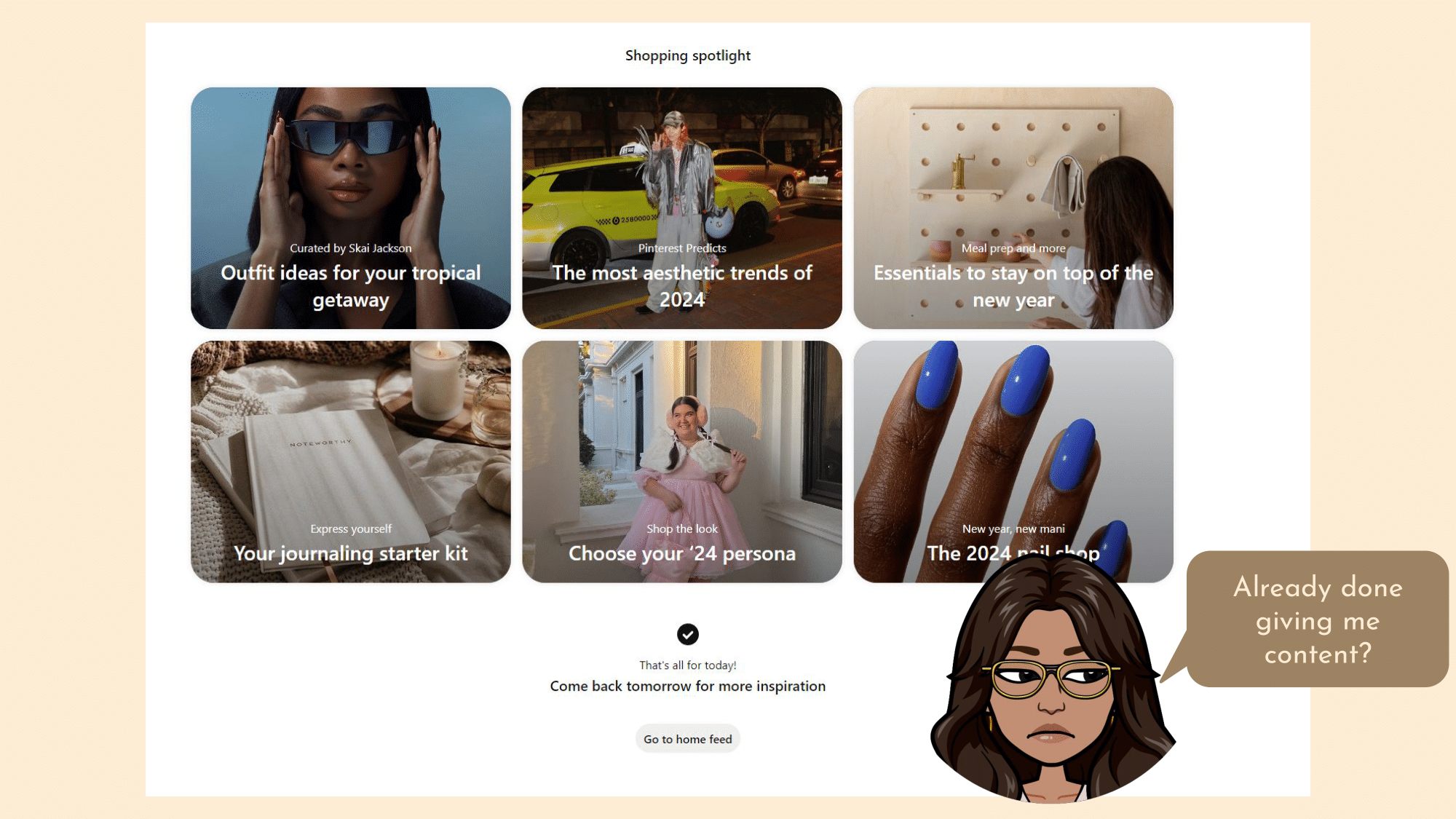
This next section in the Explore page looks like this. I am a bit disappointed that it only gives me two sections and I have to wait until tomorrow to get more inspiration. While it may convince me to return to the page to see what it has in store for me tomorrow, it may also frustrate me because when I was looking for inspiration, I was stopped short. While anticipation is a useful method to get users to return, it is better to use something that is an additional benefit rather than a feature that serves the main purpose of the app. A great example of this is Spotify. It will not stop giving you song recommendations or radio choices because that is the entire purpose of Spotify. It will on the other hand make you wait in anticipation for Spotify Wrapped at the end of the year. This is a cool additional feature that is exciting for users but does not take away from the main use case.
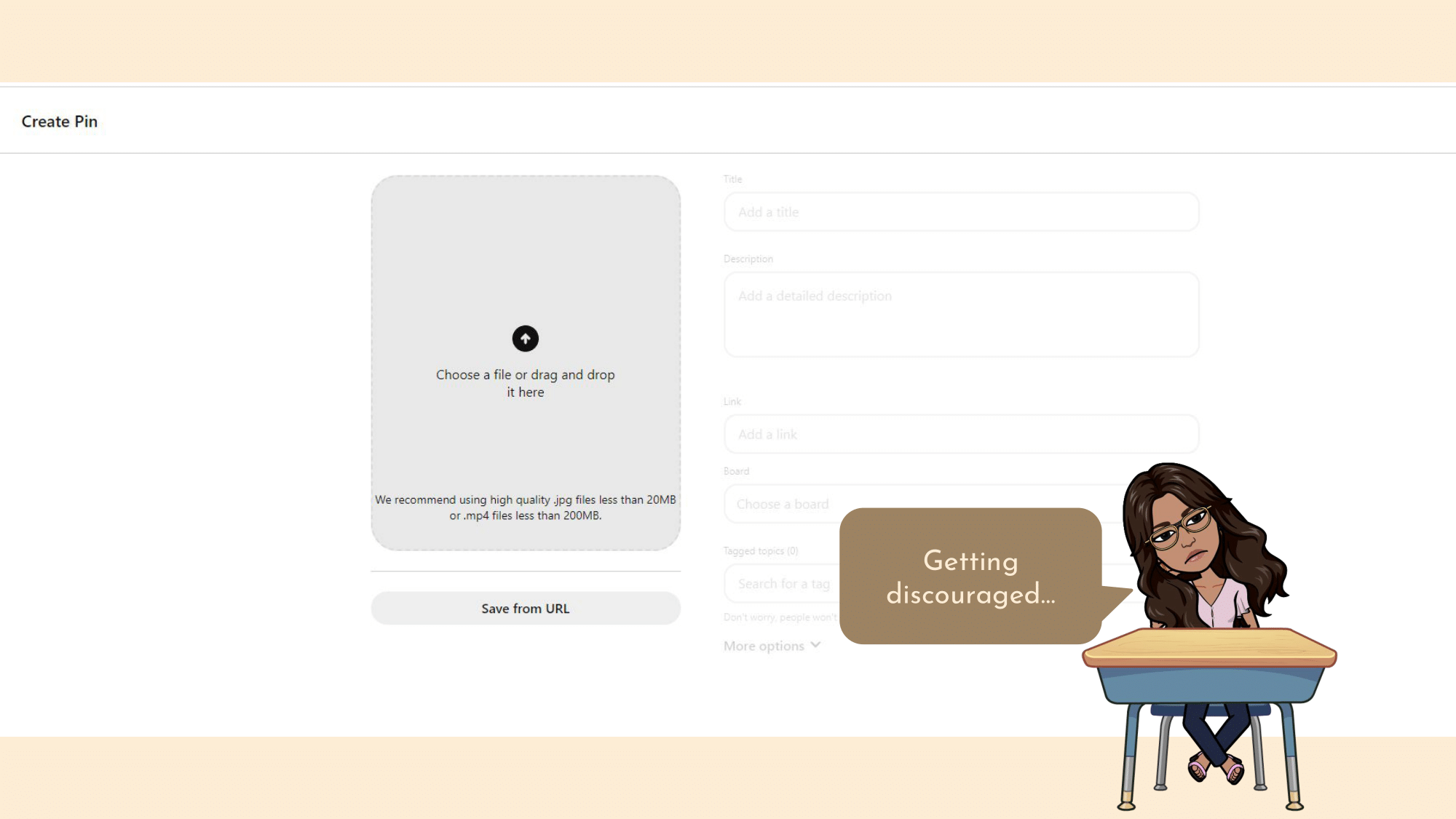
The final tab at the top is the Create tab. While this idea makes me excited to use this feature, this is the page that it takes me to when I click on it.
It’s so blank and uninviting. There is none of the color or fun that is showcased throughout the rest of the pages. This page no longer makes me excited to create my own pins. What if below it shows you creators whose pins you have saved/visited and the pins that they have uploaded. Adding a line at the top to inspire the user like “Join your fellow creators and help inspire others!”. This would actually get me excited to make my own pins. Also why is it that you can’t enter any of the information without uploading a file? A user should be able to complete these steps in any order that they desire, and should be able to save a draft at any point. What if a user is creating a pin but doesn’t have the finalized image yet and wants to start getting the information down? They should be able to do so.
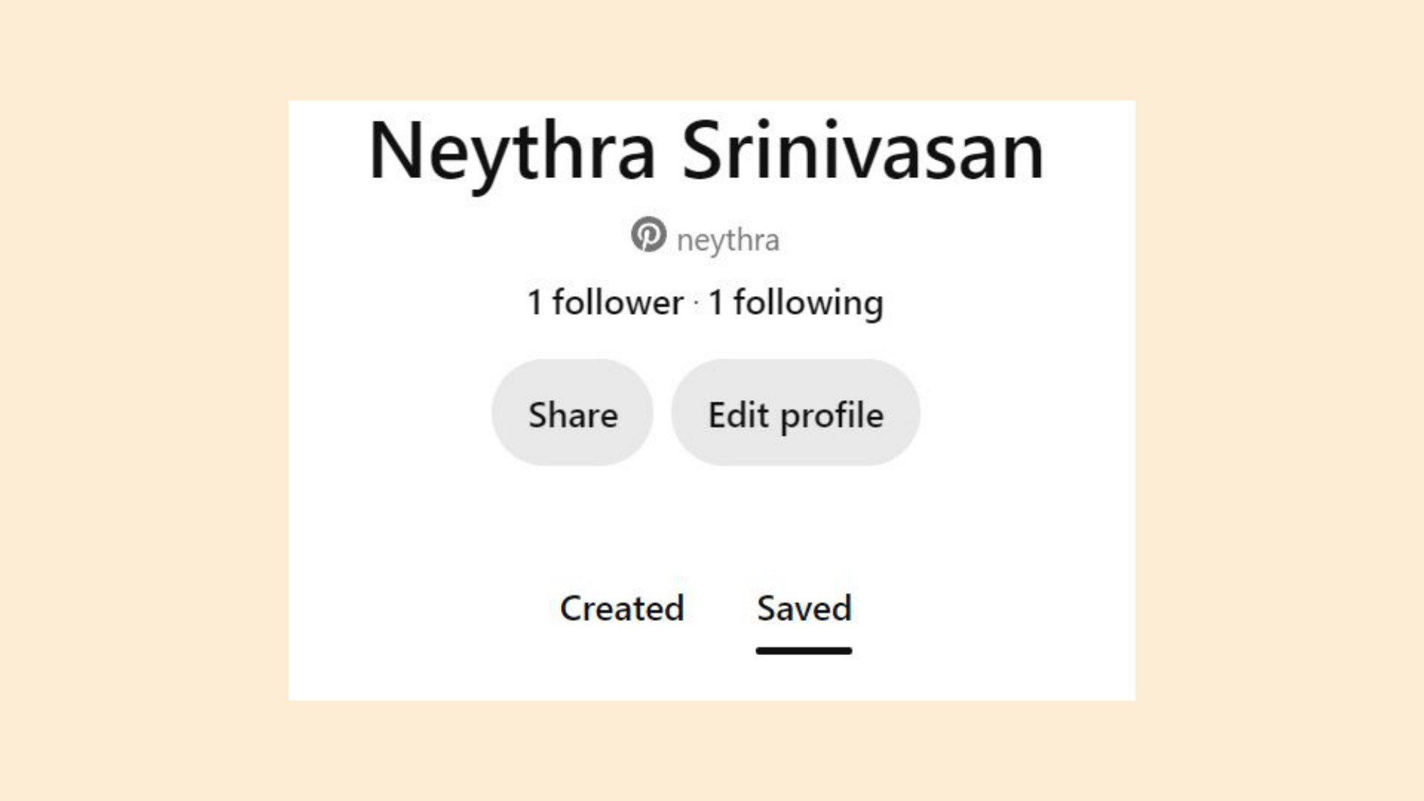
The Saved Boards tab is under your profile picture. While I understand the intention here, the profile picture typically leads to things like account setting and preferences. Plus my Saved Boards is a page I would like to visit often and therefore should be featured more heavily. Instead of putting this under my profile picture I would like a button that says “My Saved Ideas” and maybe a checkmark or a heart to represent saved pins in the navigation bar.
Overall I am happy with my experience with Pinterest and its features as well as its design. However, as we went through there were some things that could be improved. Let’s review:
1. I love the landing page. The colors and pictures are appealing and the white space is used thoughtfully.
2. The other intro pages were beautifully designed and the colors were vibrant and attractive. But some short animations in the intro would show the users what to expect rather than just static images.
3. The personalizations and suggestions are amazing. But the whitespace is confusing and seemingly random.
4. The Explore page is exciting and seems fun but a little convoluted. As a user I am not sure what type of information I can find here.
5. The Create page is dull and uninviting. I want to feel excited to create my own pin.
6. My Saved Boards is a great feature but should be accessible through the navigation bar
Hope you enjoyed this case study! Check out my other ones under the Case Studies tab in the navigation bar.