


I was excited to study Coursera because education is something that I am passionate about. I have personally used Coursera before as a student to supplement my classes for my Bachelors. It was then that I realized that Coursera was a great place to find very specific but technical material that could only previously be found in several YouTube videos that you would have to find yourself. While I do love Coursera’s mission and the quality of their courses, I could see spots for improvement in the web design and user experience, as I will go through here.
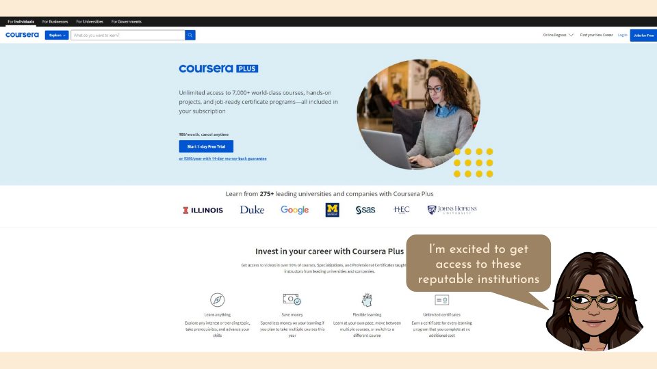
This is the landing page when you open up the coursera website for the first time.
There's a few things here that catch my eye.
The first is the biggest text that is highlighted is “Coursera Plus”. I know that this is an optional fee to get access to more courses but as a new user it may seem like this is the only option. They probably want to drive more of their users to become paying customers. While I understand trying to increase their conversion rate, it may throw users off thinking that they can’t get a taste for what coursera has to offer before committing to it financially. Yes there is a 7-day free trial but this still dissuades users because they know they are going to need to start paying in just a week. It would be nice to below this section tell users they can try and browse a limited number of courses for free without getting a degree or certificate.
The value is clearly there in the membership fee, especially because many users are probably here in order to get an online certificate. By presenting both options you give the user a choice in committing financially or trying the free version. Users are more likely to be satisfied as well as more committed to using the site thoroughly if they make a choice they believe to be their own. Users also feel more comfortable with websites that “nudge” them into actions rather than forcing them. A better way to describe these different options would to be give them equal weight in the design but with an explanation to nudge users towards a particular action as shown in the next slide.
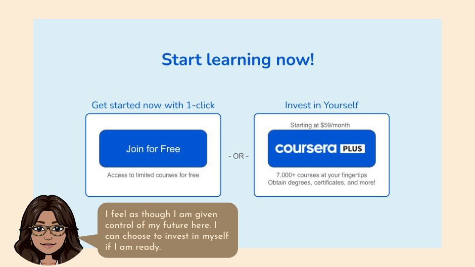
In the photo above the courses for both the free option and the CourseraPlus option should have a link that will show you the catalog of courses so that users can see the value in becoming a paid customer.
However, I do feel as though Coursera would be able to get a higher conversion rate if they gave users more access with their free version. There are many skills in Coursera that have no free version or section and thereby forces the customer to either commit financially to an unknown or walk away. This feels risky because the customer has no idea what the course will look like before they pay for it. Especially because each course in Coursera is made by a different teacher/organization there is no guarantee that the content will meet your needs. This is unlike Khan academy or Brilliant, whose content all follows the same teaching style so that if the user likes one course they will probably like all of the courses. Instead, if they offer the first few lessons in each course for free, the user can determine for themselves if the content is worth the price.
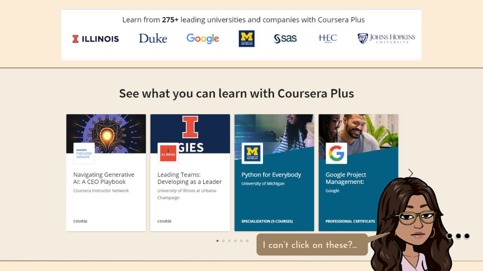
The next most noticeable feature on this page are the well known logos of successful universities and companies. Seeing renowned organizations like Google and Johns Hopkins gives the website credibility and offers something that many people can’t typically get. It’s an attractive offer but doesn’t show me any example of what types of lessons these partnerships offer, but it does draw my attention enough to want to look into it further. They managed to address this need pretty immediately, with just a short scroll downwards it gives me what I had just been wanting.
A little odd that they replaced the coursera blue and white with this beige background and teal accents that seem out of place. But I do like how it shows me some actual courses from the attractive organizations that I saw above. It also has several pages of suggestions so that the user doesn’t just give up if the first 4 suggestions don’t match what they want. A question that arises here is what is a “Specialization” and how is it different from a “Professional Certificate” and a “Course”. The number of courses on the “Specialization” modules does indicate that these are a series of courses but does this mean there is no certificate offered? The teal accent indicates a relationship or similarity between these two categories but I don’t know what. A quick legend on the side would clear this up but maybe they want the user to need to click on a course to find out more about it. Or maybe they want you to click on the course to find more and get more excited about investing in your education?... But nope, you literally cannot click on these courses even though it looks like you can without being logged in already. This is a prime missed opportunity right here to get a higher conversion rate. If one of these course titles interests me I should be able to click on it to go to the course home page and learn more about what the course contains. If it matches my needs I could directly join Coursera Pro from this course page and become a paying customer because I want access to this course
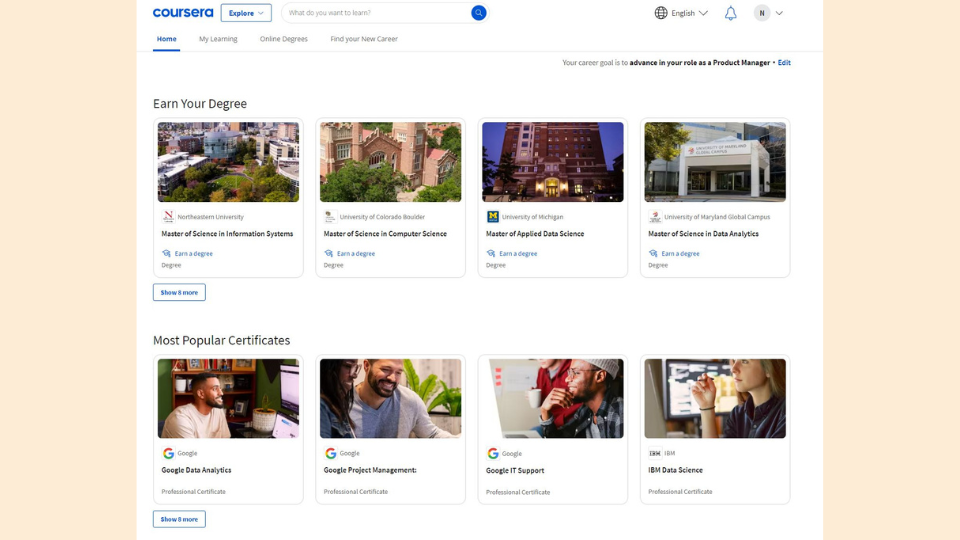
Once you have logged in and created an account your homepage in coursera looks like this. While I do like they show me 2 clear categories with separate value propositions, the pictures are not very exciting. The Degrees are just images of the college building, which on one hand is exciting because the user wants to be a part of the university, but on the other hand don’t describe the course and also show me as the user something I will never be a part of. The second row of images for the popular certificates are equally unrelated to the course material. These images just look like random stock images of people working with no specifics towards the course itself. This makes it not feel as though much work has been put into each of the courses due to the generality of these photos. This is the antithesis of the labor illusion which states that people value things more if they see the hard work behind it.
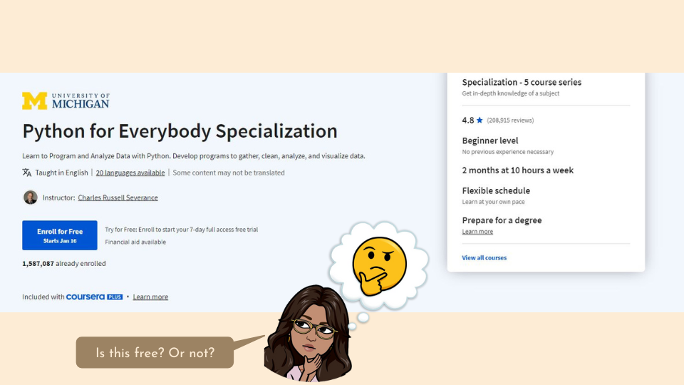
Once you click on a certain course this is the page that will show up. The first thing that draws my eye here is the big blue button that says “Enroll for Free”. This makes me excited because I think that it is a free course. I have to read the fine print next to it in order to realize that you actually do need to pay in order to access this course. I am a little disappointed because I feel as though the button is misleading. However, I am a bit more encouraged to buy the Plus package in order to get access to this course.
Only once I scroll down on this page does it tell me that completing this course will get me a career certificate from University of Michigan. This should be one of the first things you see when you click on this course because that is one of the main value propositions of participating in the course and buying the membership.
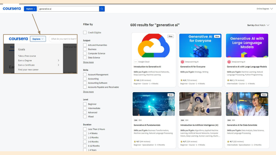
What I find frustrating as a free user, is that the home page does not show you any free options and there are no obvious filters in order to search for free courses. You actually need to click on “Explore” and select “Take a free course” under “goals”. This would be fine but this link just takes you to a search for the word “free”. This is frustrating as well because what if you want to narrow down your search further? It would be much nicer as a user to include a filter for free courses.
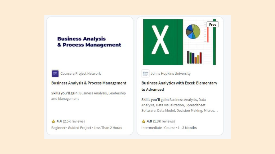
What is even odder is that once you search for free classes, some of the options have a tag called “Free” on them whereas others do not, even though they both have an “Enroll for free” button.
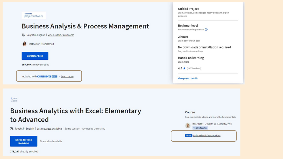
… But they both have these “Coursera Plus” tags on them when you click on them, and in different styles.
When inconsistent design styles as well as unclear information, the user's cognitive load is significantly increased. This increases cognitive dissonance and decreases the chance the user will complete the action because they don’t understand what they are getting into.
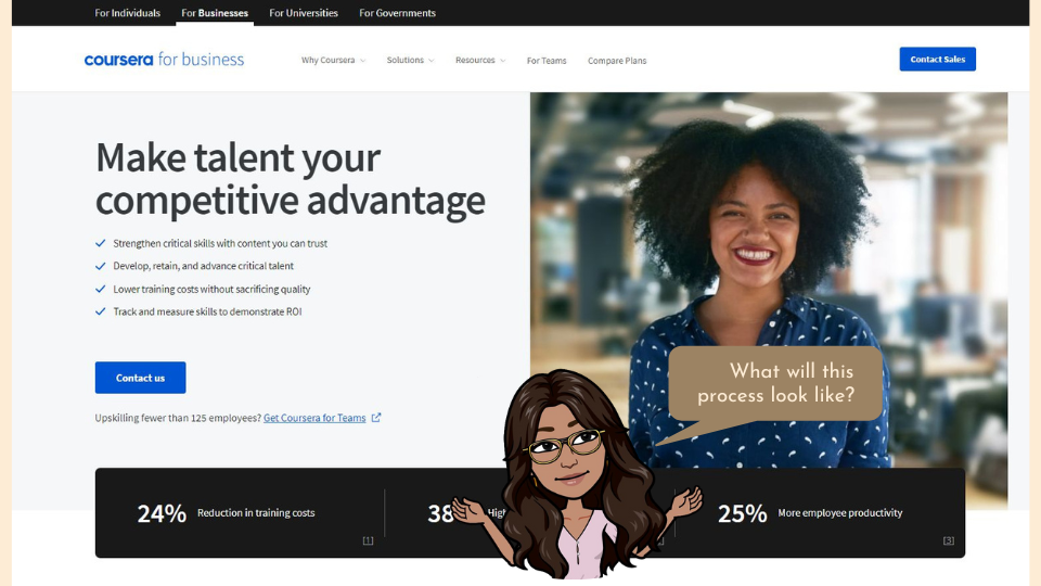
For Universities, Businesses, and Governments, you need to contact Coursera in order to get started. Because this is probably a process and a lot of effort and time to get started, it would be nice for them to know what the process looks like before they invest the time in contacting Coursera. Because these types of users are providing the content needed to supply the other users it is important that this site is equally catered towards them. But the lack of information that can be obtained about how this process works can deter organizations from contributing to the pool of information. A video or animation detailing how the process works and the duration of time certain tasks take would greatly improve the users comfort with the product. Knowing what these organizations are entering before investing their time improves how these users opinion on a product (feedforward).
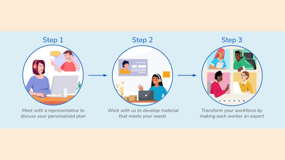
Even a simple diagram like this would be greatly beneficial. Just 3 simple images will give the user some comfort.
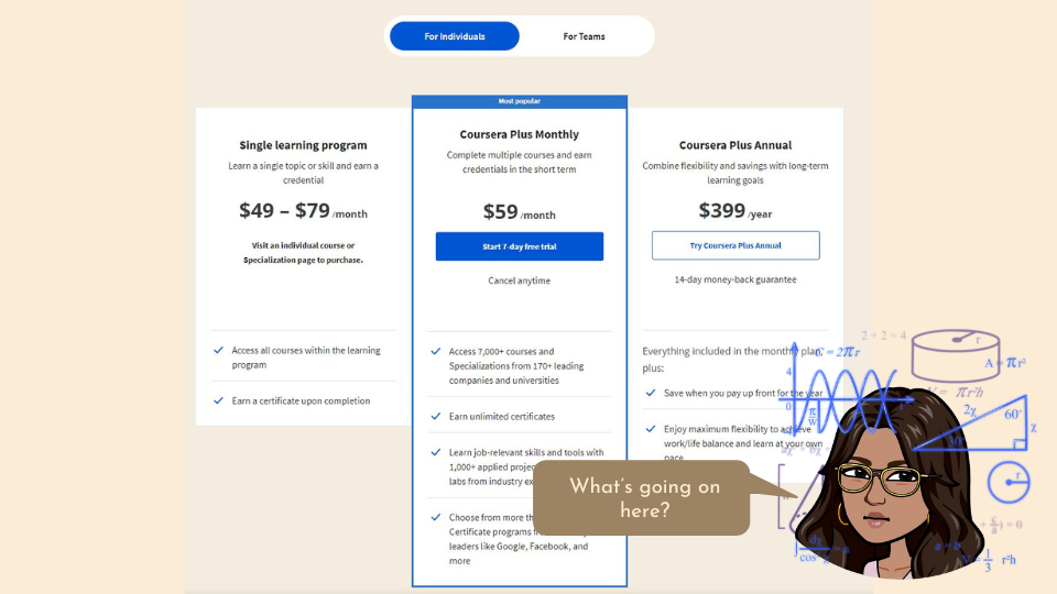
Looking at these prices for Coursera plans it seems odd. First of all, I immediately noticed the high price for these subscriptions. While higher education typically costs a significant amount, many may be using this to supplement their education and will therefore have to cover both of these costs. While the price is not that high for higher education in general, subscriptions tend to be in the $10-$30 range at which people are comfortable. Since this is higher than a common subscription price, most users will need to take the time to determine whether the value is worth the cost. Second of all the “Single Learning Program” is not able to be accessed from here but what is weirder is that the price ranges from $49-$79. It doesn’t make a ton of sense because this is for just one course and the price for 7000+ courses is $59/month which is within the single learning program cost range. It is confusing the difference between these two. Additionally, if the Coursera Plus Monthly is supposed to offer access to more courses then why isn’t the single learning program cheaper? Maybe they want to imply that the user just needs to spend $10 more dollars in order to get unlimited access rather than just one course. But it simultaneously has the negative effects as the user is uncertain how these prices were determined.
For the Coursera Plus Annual option it would be nice if they would tell you how much this is monthly so you could see how much you would save per month. It is actually a significant saving for the annual option ($33.25/mo instead of $59/mo). Here is again a missed opportunity to get users to commit financially for a whole year. This will trigger an Investment loop, which means that if the user invests in themselves then they are more likely to return. An almost $400 investment that a user makes in themselves will influence them to keep coming back so they get their money’s worth. However a $60 investment, while not a small sum, is an amount that people can justify losing much more than $400. Another benefit of the annual plan is that you get 2 weeks of access with a money-back guarantee which makes the choice feel much safer and doesn’t require users to buy 1 month just to see if they like the site, only to have to buy the whole year immediately after. It would be nice as a person considering committing to an entire year to get a week or two free like you do with the monthly plan, rather than just your money back. This amount of back and forth between these three plan options with clear pros and cons for each option makes it hard for the user to make a decision. This is a high cognitive load on the user and will lead to a lower conversion rate. You want your plans to have clear differences that cater to different types of users so that the customer can quickly decide which bucket they fall into and start becoming a paid customer.

Coursera has many target markets that they have built up resources to cater towards. This diversifies their market so that changes in trends or competitors will not crater their business as their other revenue streams can continue to support them. At the same time this can be a double edged sword because coursera now needs to stay up to date with innovations, trends, and competitors within 4 different target markets. The 4 markets they cater towards are individuals, businesses, universities, and governments. By serving both individuals wanting to learn and the organizations who want to educate, coursera is able to take advantage of both an unmet need and an untapped supply. By harnessing the user base of both the supply and demand, coursera has found a hole in the market.
In addition to these 4 target markets, coursera has managed to branch out to many target locations by harnessing the use of AI. AI allows for fast and widespread translation of Coursera courses into many languages. According to that article, they have in the last year translated 4,000 courses into 18 different languages. Expanding globally is key to growing a company, especially if the target market exists outside of the local area. There are individuals, businesses, universities and governments all over the world that would benefit from the same system to share information just as much as Americans. Not only will this grow the user base significantly, this is also ethical because everyone deserves access to education, no matter where they are located. This improves the public’s perception of the company and due to the Noble-Edge Effect that states that users tend to prefer socially responsible companies.
Coursera has some great content that helps students and other individuals across the world get access to education at their fingertips. However, there are some opportunities that can be taken advantage of and changes that can be made to improve the experience of the user. Let’s review our experience on Coursera:
1. The landing page draws me right to CourseraPlus. But it is not clear to me here that there is a free version. It’s important to not drive away users that are unsure about an investment without using the product first.
2. The highlighted courses make me excited and give me the opportunity to see how I can benefit through Coursera. There is a missed opportunity here not to let users click on the site and join Coursera Pro from the course page.
3. The free vs Coursera Plus courses are unclear and confusing. The tags and designs are inconsistent prompting me to wonder what is different between courses.
4. The pages for business, governments and universities are vague and lacking in information.
5. The financial plan is convoluted making me hesitant to commit to a certain plan.