

I was excited to review the Etsy website because I have had the experience of using it both as a consumer and a seller. However, I wanted to approach this study as though I am a consumer who has not visited the site before and does not have any knowledge of Etsy.
Let’s assume that I am a user who wants to buy a thoughtful gift for her boyfriend’s birthday. I might look up “gifts for boyfriends” on Google. When I do that, Etsy is the 5th link on the page, but the first ecommerce platform. The first 4 links are actually articles that list ideas. Maybe I want to search for something more meaningful so if I search for “handmade gifts”, Etsy is the 2nd link that pops up. It is important that Etsy shows up early in the search because handmade items and small business owners are their primary value propositions.
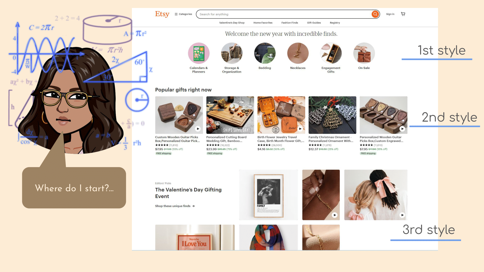
When I first visited the Etsy site I was immediately overwhelmed with information and pictures which both gave me a positive and negative reaction.
Positive reaction for the verification that there will be many products to browse from.
A negative reaction because of the overwhelming formats, designs, and photos on the landing page with no clear focus. There are 3 different styles to display products on one page which can confuse the user.
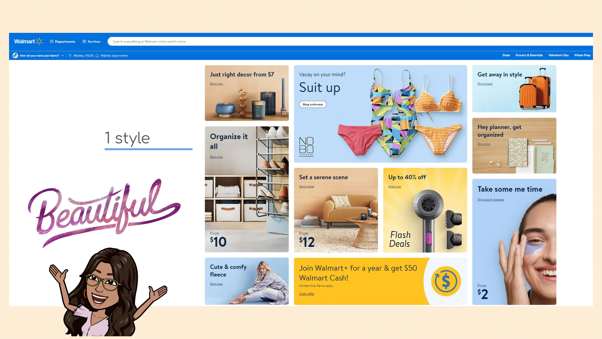
Walmart for example does a better job of displaying many products without overwhelming the user. They do this by using one style to display all the categories and use categories instead of random listings to give order to the products. You get an idea for what is available and the price without displaying several different formats.
To encourage one click journeys to a product, you could have the user hover over each of these categories and then let it show you particular listings that you can click on with the option to search through the entire category.
One useful tactic that Etsy employs is that it does not require you to onboard in order to shop. This is good because as a shopper I might not want to invest time into making an account before I know if there is something that satisfies my needs.
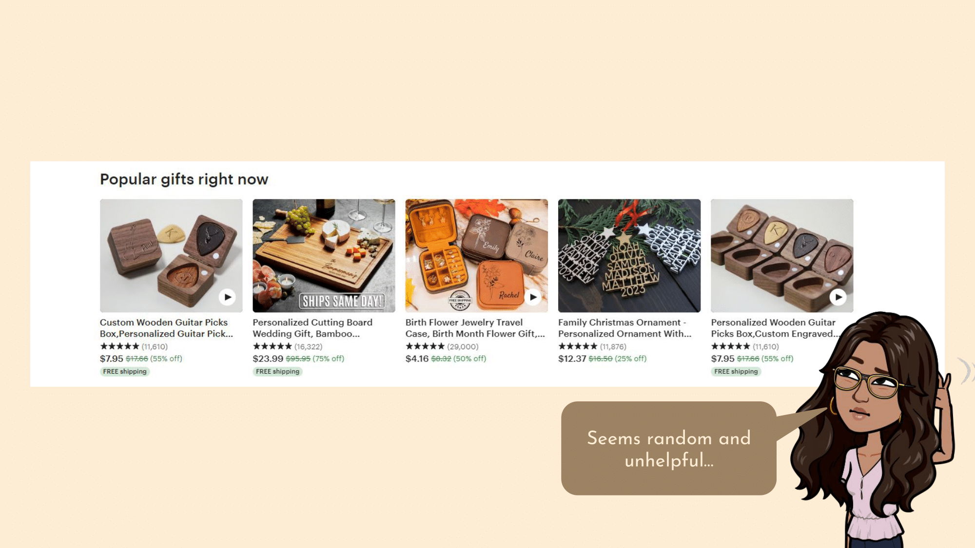
My eye is immediately drawn to “Popular gifts right now” as it is bolder and larger than most of the other text. However when I look at what it shows, there are for some reason 2 options for custom wooden picks which is odd because they only have 5 spaces and two of the same item provides no new information in a limited space. This is also a weirdly specific object that may not apply to many people, only those who play the guitar. It is also odd that I am getting a suggestion for a personalized christmas ornament when Christmas has been over for more than 2 weeks. Therefore out of 5 of these main spots only 2 of them seem relevant to me.
Also every item on the popular items list is discounted heavily. This makes me a bit suspicious. I know there could be a site wide sale, but it’s not holiday time so it makes me wonder if all sellers put a fake discount on their items to drive sales by making customer’s think they’re getting a limited time price. It could be interesting information to know why each of these items are discounted.
The landing page doesn’t feel very personalized to me which does throw me off. It would have been nice for Etsy to offer an option to answer a few prompts for who you are and what you are looking for when you enter the site. This way you can get personalization with just a few quick clicks.
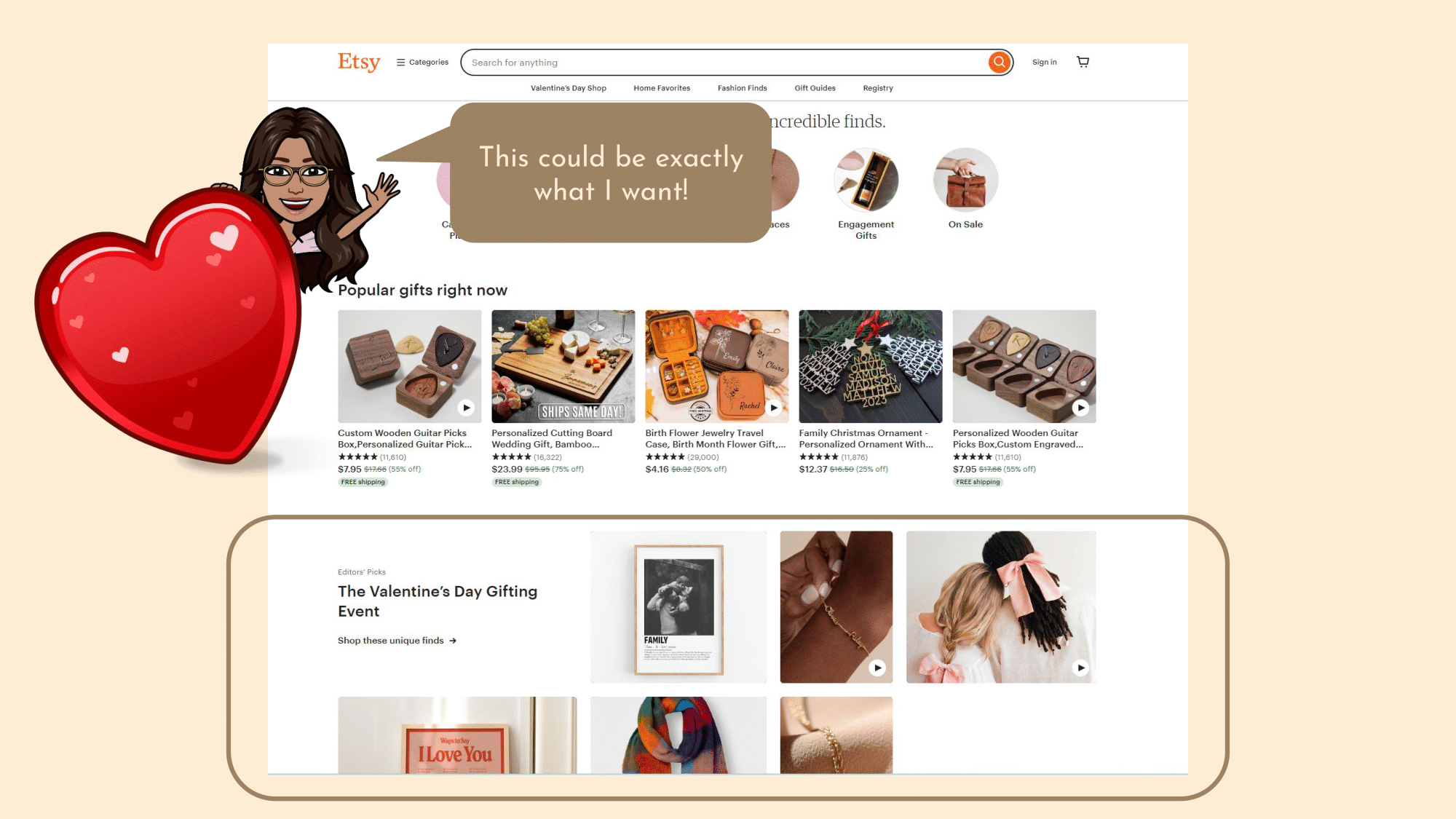
Typically people come to Etsy for a specific reason. Either they are looking to sell something in particular or they are looking to buy something in particular. Immediately after popular gifts there is a Valentine’s Day section. This is good as Valentine’s day is only a month away so it is highly likely people are coming to Etsy for personalized or handmade Valentines gifts.
However all the options on the Valentines Day list seem catered towards women. If I was looking for my boyfriend none of these would satisfy my request. It could be a good idea here to add just a few filters so you can swap through “For Her” “For Him” and “For Them” and get 6x3 the number of quick looks.
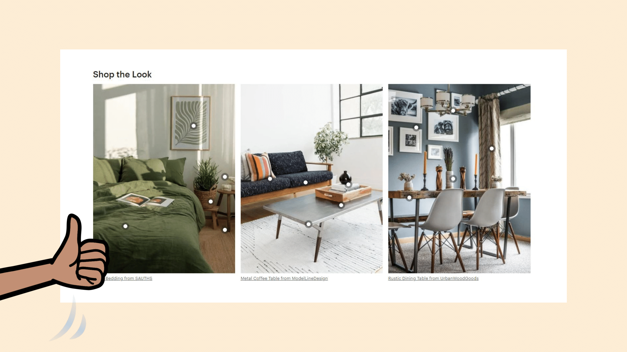
Next there is this “Shop the Look” section. I really like how you can see how the items will look in a home and shop based on aesthetics.
However when I hover over these dots it gives me similar suggestions but not the exact item that is in the photo…
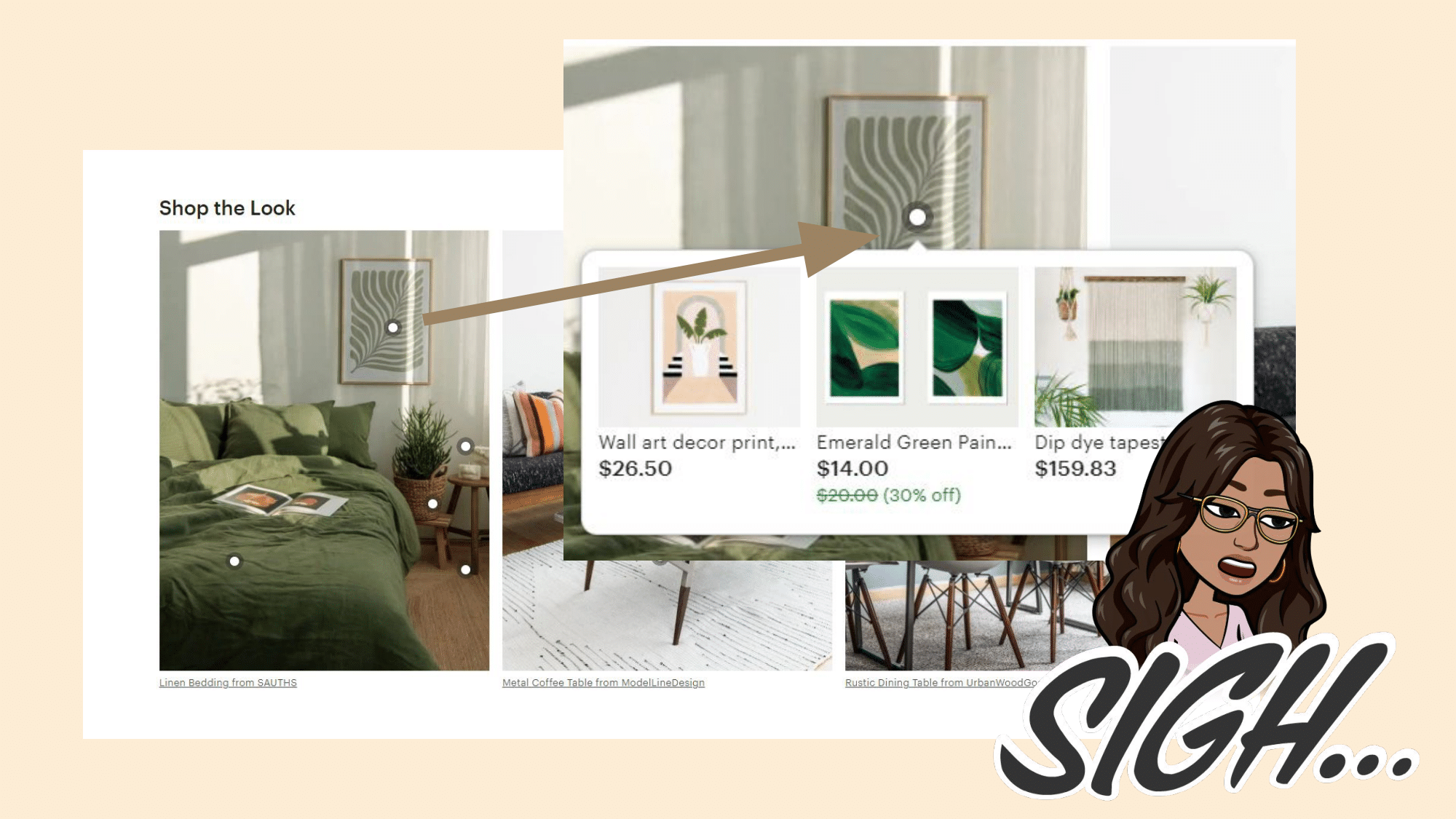
It seems odd that they would suggest shopping for the items in this photo and not even have that item when you hover over it. If this is a feature where you can find similar items in inspiration photos through a feature this would be a great way to introduce that. However, it doesn’t seem to allow users to upload their own videos, nor does it imply that you could purchase similar items that match the aesthetic in the photos.
To be honest this section is both misleading and disappointing. Actually a fantastic use for an API here would be allowing users to directly grab images off of their pinterest and search for similar items.
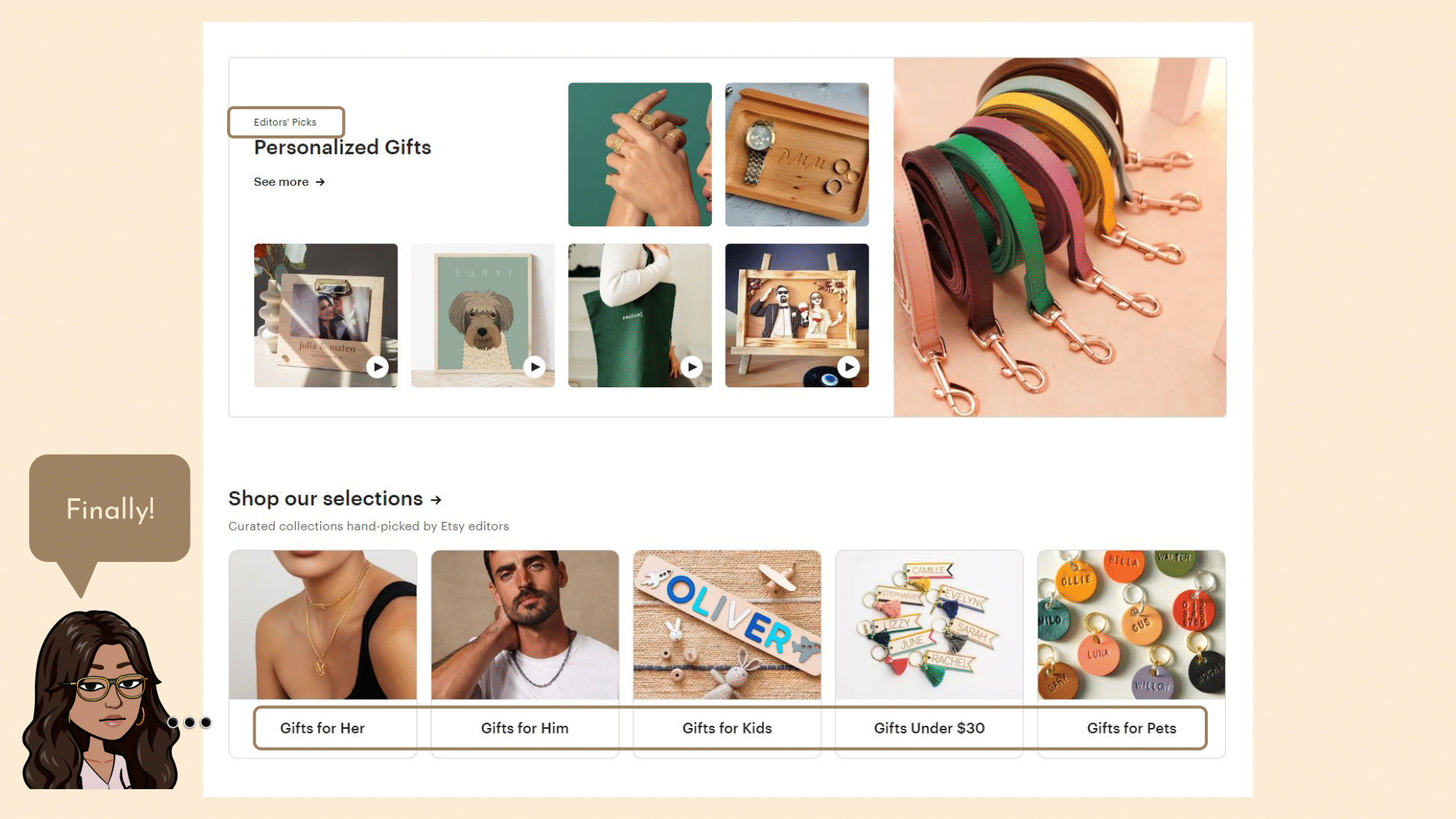
Next is personalized gifts. I do like how when you hover over many of these items you get a little video which makes the product feel real rather than just a photo of a product. However, the tagline of “Editors’ Picks” makes me wonder who picked these out and whether or not I can trust their judgment. Who is the editor? Another option would have been to either say “Etsy’s pick” for users that have not logged in or “curator’s pick” for users who have logged in and personalized their site. Influencers, celebrities, or other Etsy personas should be able to curate their recommendations based on their aesthetics. Users should be able to follow these curators or Etsy should give recommendations of certain curators based on a user’s past purchases and aesthetics.
This would feel much more geared towards me and as a user I would trust who the recommendations are from if they are given a name rather than a vague “editor” tag.
Finally you get the major filters with “Gifts for Her” etc. Why did it take so long for me to get to these big filters? I had to scroll all the way down the page and to be honest with you, I wouldn’t scroll all the way down if I wasn’t writing this case study. The only other options for filters before this is the button by the search at the top which has a ton of categories, which is overwhelming.
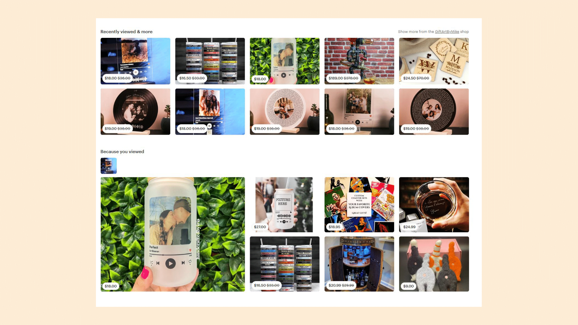
Now that I have clicked on some items and done a bit of browsing, the landing page has transformed to make it personalized towards me.
What’s odd is that I only clicked on one of the items in the “Recently viewed & more”. It seems like all the other options are suggestions based on that one visit. The “Because you viewed” is also based on the same item that I visited even though I clicked on multiple links. While this personalization does excite me, all the suggestions being similar to each other reduces my interest because it doesn’t seem like there is much value I can get from here.
The user has already looked this up so they know it exists but sometimes you want Etsy to give you new ideas you never would have looked up before but still match the themes and aesthetics of previous searches.
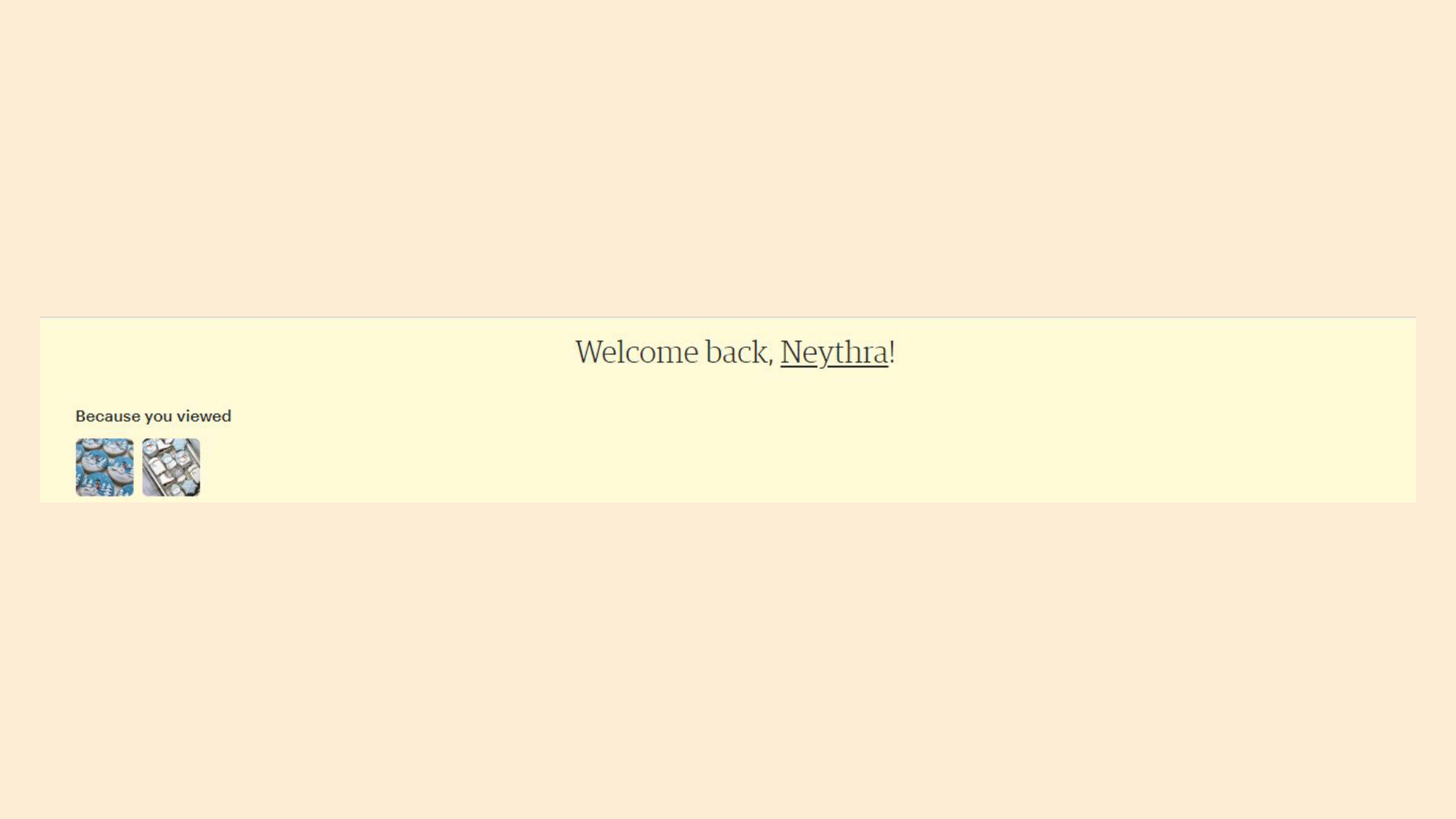
When I am logged in, I do feel like there is more personalization. Calling me by my first name seems friendly and makes it feel mine.
But the color as well as the size of the text compared with the size of the box throws me off. The color is both one I have not seen associated with Etsy before and also makes it look like a notification compared to the vibrant Etsy brand color.
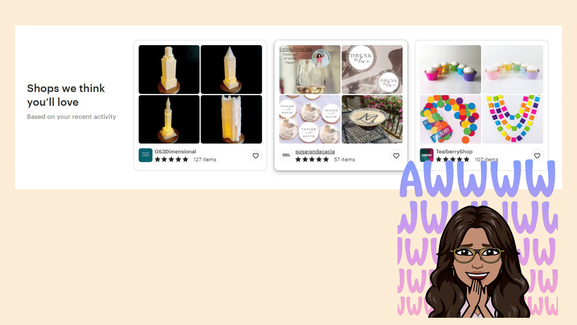
I do love this section here: “Shops we think you’ll love”. It is not forceful and simply “nudges” the user by using language like “think” and also makes the site seem empathetic.
I also like how I have not looked up anything like this so it is giving me brand new content but with similar aesthetics to my history. I also like how it gives me the shop name/link as well as the reviews in the snapshot.
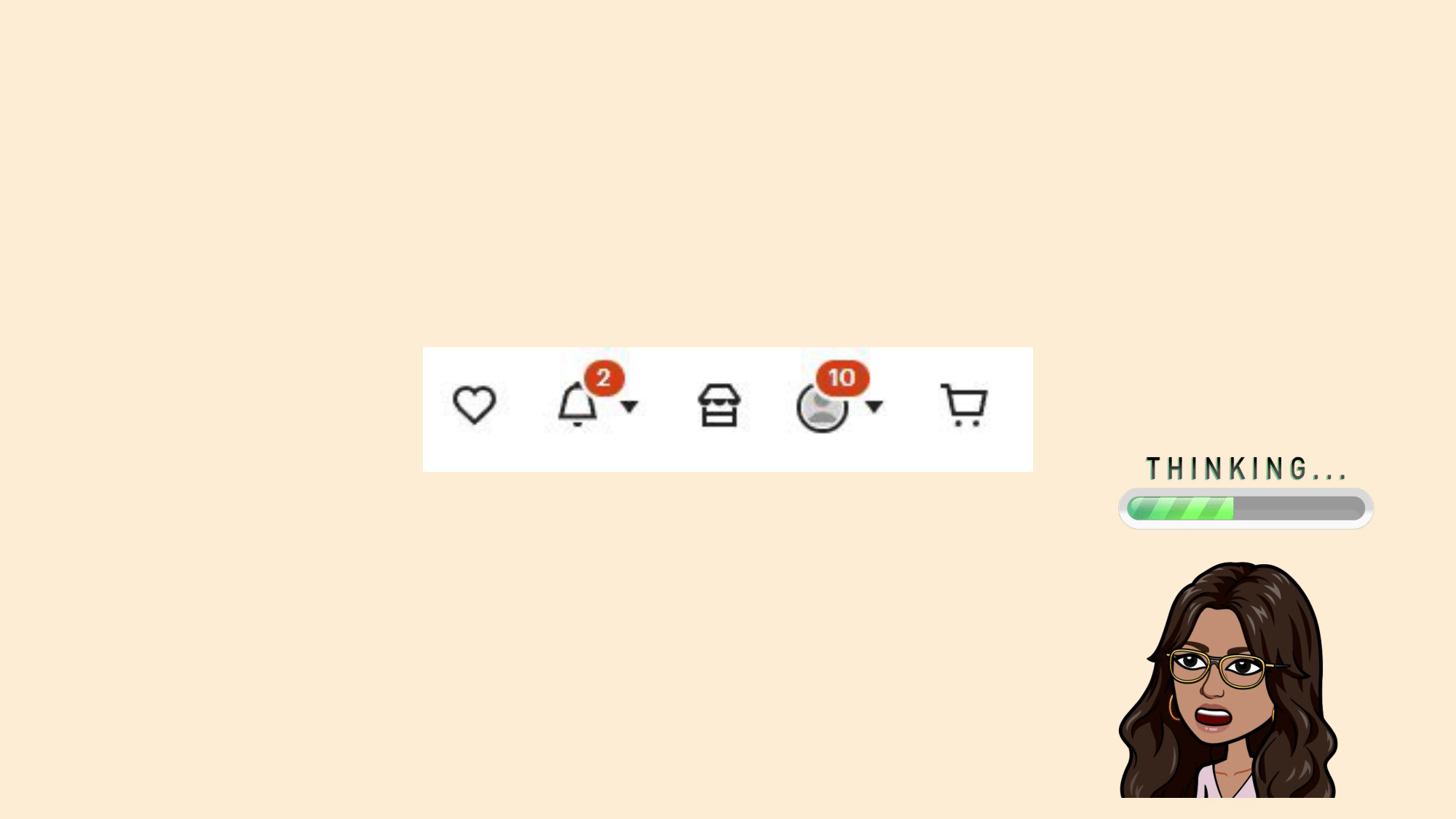
These symbols up here all in similar styles and sizes make them seem related (The Law of Proximity) but they are actually not quite related. The closest relation here is actually the shopping cart (last) and the favorites (first) buttons and they are the furthest apart.
Plus I feel like “Shop” has no business being there. This is a big deal and a completely different interface for the sellers page. I feel like if you have opened a shop this should have some juxtaposition to help it stand out from the rest of the symbols. Some customization here would be great to make the shop really feel like “yours”.
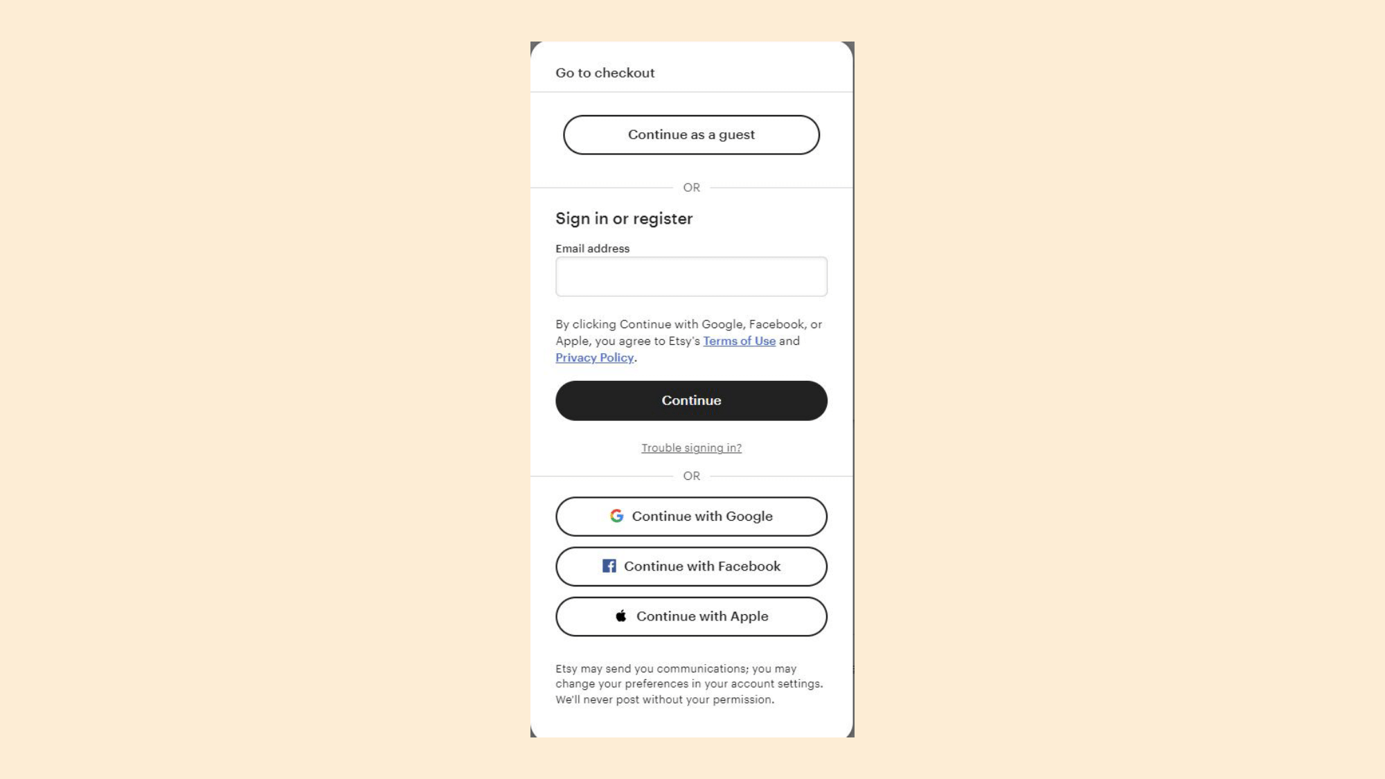
Etsy really doesn’t lead you onboard onto their site. Even when buying an item without logging in you can complete the transaction as a guest. However at the same moment it provides you with an opportunity to create an account quickly, either by using a 3rd party log in or creating your own account. Notice how it only asks for 1 input to create a new account at first to reduce the cognitive load on the user and make them feel as though there is only one step required.
Once adding the email address, it takes you to another step where it asks for your name and password. Separating this into two steps consisting of 1-2 inputs makes the task feel much more manageable to the user.
My go-to is “Continue with Google” because it is a 2-click log in. For me, continuing as a guest is risky because then my order may not be associated with me and if there are any issues, I am worried that it would be hard to solve. This illusion of choice would be solidified with some priming, for example a small byline that says something like “Create an account for easier service and order tracking”.
Reviews are everything so it is nice to see that Etsy prompts me to review the store I just purchased from with a simple 1-click. This idea uses the Spark effect: users are more likely to take an action when the effort is small. It also gives you a verbal cue as to why it is important to take this action, and makes the user feel as though they are doing something good with this.
Reviews can be a daunting task for the user because they feel required to write a whole paragraph and get to the review location on their own. This reduces the cognitive load placed on a user for a shop review.
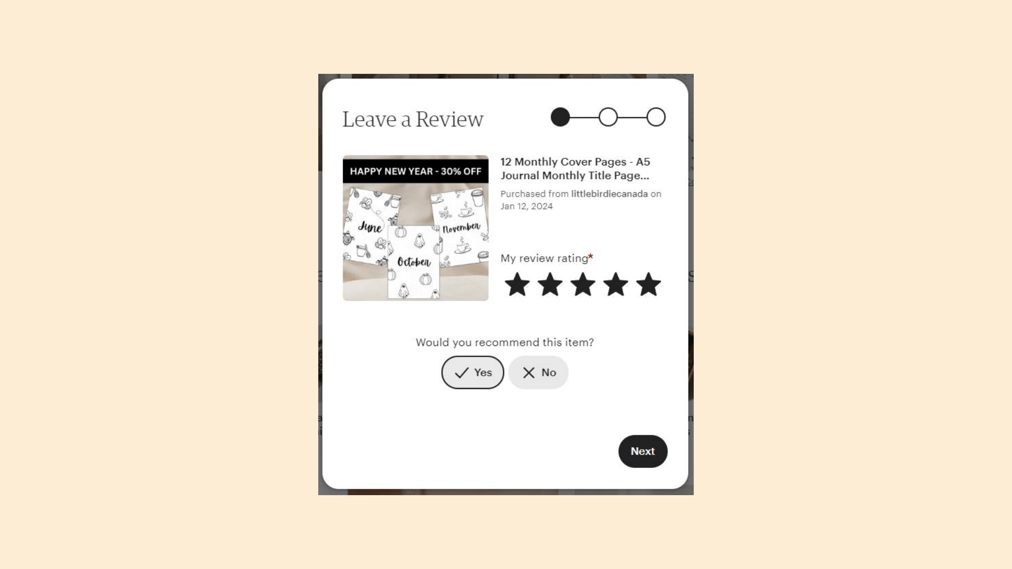
After clicking on a star-review it gives you 3 more steps that you can take in order to finish your review. While I feel a bit duped into thinking I could help this business grow with just 1 click, the ease of the question in the first window and the map in the top right that shows there will only be 3 steps does motivate me to continue.
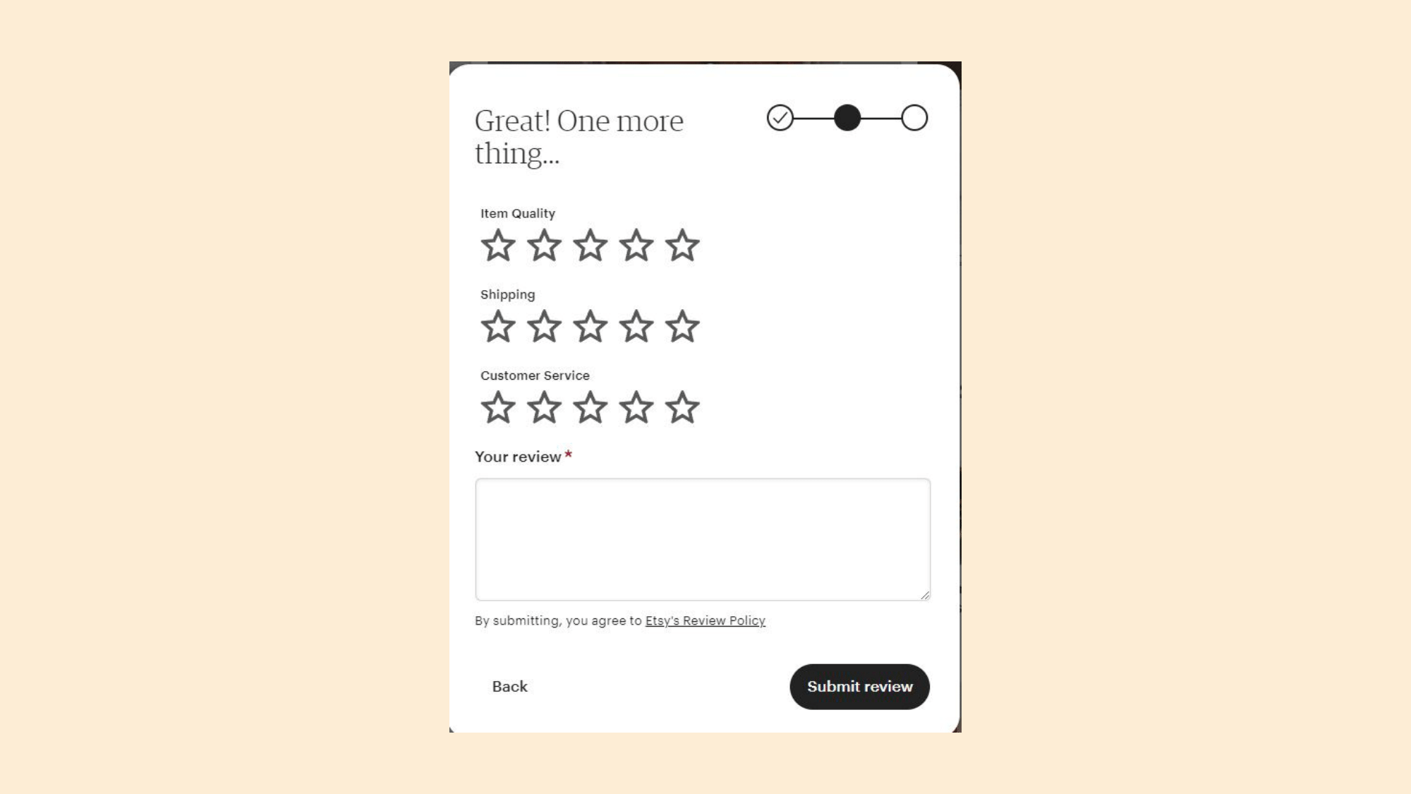
However, when you go to the next window there are 4 inputs that it asks for which now I am losing interest in continuing this process that I initially thought would be only 1 click:
What is especially frustrating is that it requires the user to write something. It already is asking for several 1-click inputs that I wasn’t expecting and now it is requiring me to write something? This is unfortunate because this definitely dissuades a lot of buyers from finishing their reviews and reviews are so important for business to become successful and for customers to feel comfortable in their purchases.
Why not let a buyer who you have verified has bought an item from that shop leave a starred review without a description. Right above it already asks you to break down the starred reviews which gives other buyers more information than just a number out of 5.
If Etsy made the description optional and just gave the user another nudge letting them know how important their words are, users would be more likely to write something. Simply tell the user “Reviews with descriptions increase sales to shops by ___%. Help this shop excel!” right above this section. This will both make the user feel that Etsy is empathetic and also not forcing them to make a decision that is more likely to lead them to abandon the process entirely. Plus I can't even go ahead to find out what the next step entails before writing this review out.
What if I put in the effort to write a review and there is another step that takes even more time and further increases our cognitive load? I will feel even more dissatisfied with my experience as a user and frustrated that I wasted my time with a process that took significantly longer than expected. Allow users to preview each step before they complete the previous steps so that users can look forward to what they will be getting into (feedforward).
To list a product on Etsy for 4 months only costs $0.20. This is a small cost that almost feels negligible especially as someone just starting out their shop without many products. Because this is the only upfront fee required for selling it makes using Etsy an attractive platform. The issue with this is if you only put a certain quantity of listing and it sells out, to re-list the item you have to pay the 20c fee again. This is particularly frustrating for sellers who hand make their items and can’t always have stock ready to go but want to continuously relist an item as it is made.
However there are many other costs that end up being placed on the seller that many shop owners feel burdened by as they go. First is ads. It is basically impossible to sell on Etsy at first without using the ad function. So while this feels like an optional cost, it quickly becomes a required one. This cost is 12% if your shop has made $10,000+ in the last 365 days and 15% if it has not. This is an incentive to buy more ads to achieve this revenue and get the lower rate. But this is also confusing because presumably you won’t need as many ads when you start bringing in a large steady revenue.
You also as a seller have to pay for shipping which in the age of Amazon feels frustrating. Sellers quickly realize that shipping is quite expensive and a tedious process, but this is not something that any other small business platforms have solved so it doesn’t really hurt Etsy. Etsy charges 6.5% of the item listed each time that it sells. Now while you don’t have to pay until your item sells, 6.5% can be quite a bit for the limited resources that Etsy offers. Since the services don’t increase with price it does seem frustrating that you have to pay 65c for a $10 item but $65 for a $1000 item.

Immediately, I noticed that there are two distinct types of users on Etsy: buyers and sellers, but there are no questions from Etsy about what type of user I am. In fact it defaults to the buyer interface. It makes sense that Etsy wants to drive people to where they sell products and make revenue, but the button to find and start your shop is so small that it is hard to find. It doesn’t feel very welcoming as a seller that it is not advertised on the landing page.
While Etsy does offer a platform and ads, many small business owners have decided that the cost of Etsy is too high. They do their own marketing through social media and buyers are able to find their personal sites through there rather than searching on Etsy.
A big issue with Etsy is that the idea of selling handmade items for small business owners has quickly been replaced with dropshippers from Temu, AliExpress and other sites like this. The main value proposition for buyers in Etsy was getting good quality handmade items that are worth a higher price tag for the labor of love that goes into each item. If this is gone and users don’t know whether an item has been handmade or dropshipped, the value of Etsy quickly disappears.
What is good about Etsy is that you can communicate directly with the sellers, even before you have placed an order. For handmade gifts that have customization it is nice to be able to communicate directly with the seller so the product turns out exactly like you want it to. What would help this issue is if sellers were required to upload process videos or photos to verify that it is handmade and then give them a specific tag so buyers know whether or not something is authentic. Also encourage sellers to upload these videos so that users are able to make that discernment for themselves as videos and photos can be faked. Many handmade Etsy business owners do much of their product marketing and process videos through social media such as TikTok and Instagram. It would be nice to offer an option for users to connect to the owners’ social media to see how the community views their products and to see how they have built their product and business.
The shop features are actually pretty good. The statistics that they provide can actually help a seller get insight as to how consumers view their products. They have a chart that shows your sales and how many visits your page got. This helps you learn the “conversion rate” of your page which is the amount of users that converted from simply browsing to become a paying customer. It also tells you how shoppers have found you (either through direct traffic, Etsy, or social media) which can tell you which of your marketing methods is the most successful.
They have actually just released a Beta of marketing guidance through a new section called “Growth Tips” which shows you checklists that help you achieve goals as a seller as well as testimonials. While it does seem like some good information, there is no personalization here. When I see something new like this in Beta I am hoping it will have some sort of personalization and AI generation. So I am a little disappointed here but if I was a struggling seller it would at least give me a place to start learning how I can improve my business.
While I am excited both as a consumer and seller that a website like Etsy exists to serve this hole in the market for handmade small business owners to conduct sales online, Etsy did not live up to my expectations. To review my experience:
1. I am excited to find a gift for my loved ones! I want it to be meaningful and Etsy’s provides me with the types of gifts I am looking for.
2. The landing page is cluttered and confusing. On one hand I am happy because there will be many products to choose from, but on the other hand I am overwhelmed.
3. A Valentine’s Day section perks my interest because the holiday is coming up
4. The “Shop the Look” section gets me really excited to see products that fit with my aesthetic
5. But… the products don’t match and I can’t upload my own photos to shop my aesthetic. I am disappointed now
6. I finally see the big categories! It took too long to get here…
7. Recommendations are helpful and match my recent searches, but don’t provide me with anything new
8. Once I am logged in, I love the personalized touches. Really seeing the value in making an account, but it wasn’t conveyed to me prior.
9. The reviews seem easy to do and Etsy helps me understand why it is important, i'm excited to help out a business
10. But the requirements are far too intense and the time took much longer than expected. I am dissuaded from leaving this review and reviews in the future.
TLDR: Etsy has found an opportunity to capture both the consumer and seller profits with a unique value proposition. But there are many improvements that can be made to improve the user experience and attract more customers.
Check out my other case studies under the "Case Studies" tab!